# Ad summary
This ad showcases a woman detailing her custom destination wedding invitations from Minted. She highlights how she made everything feel custom and was able to bring so many themes from the wedding weekend into the stationery, including an envelope liner designed by her brother and triple thick paper with letterpress detailing coordinated with their save-the-dates. She also details how she worked with the Minted design team to add an interlocking S that her brother designed for the RSVP cards. Overall, she wants all of her stationery to be this high quality.
# Brand positioning
Minted is positioned as a premium brand that allows customers to design completely custom paper goods and stationery. They enable the incorporation of unique, personalized elements into the product, allowing customers to realize their vision. The brand prides itself on the high quality of its paper and printing options, positioning itself above standard stationery services. The design team offers expert support to bring any concept to life, underscoring Minted's commitment to customer satisfaction and a high-end, bespoke experience.
# Product
The product advertised is a custom wedding invitation suite from Minted. The invitation includes RSVP cards, envelopes with custom-designed liners, and premium paper stock with letterpress detailing. The entire suite is designed to incorporate themes from the couple's destination wedding, with each element working in harmony to create a cohesive and personalized experience. The suite includes triple-thick paper, interlocking monograms, and pearl detailing. The invitation suite is presented as fully customizable, allowing customers to reflect their unique style and event themes through high-quality stationery.
# Visual style
The ad features a polished, lifestyle aesthetic, blending natural light with carefully staged shots. The editing style incorporates smooth transitions and static shots, creating a calm, refined feel. The production quality leans toward a polished commercial, enhancing the high-end positioning of the brand. The pacing is consistent with a moderate BPM, ensuring a smooth viewing experience. The combination of these elements creates an elegant aesthetic that matches the brand's positioning.
# Hooks
Spoken: Our wedding is coming up in just a few weeks and I had so much fun designing our invitation suite with Minted.
Visual: 00:00–00:02: A woman, mid-30s, light skin, long blonde hair, wearing a white tee, light-wash jeans, and sunglasses, enters a post office carrying a tan box with a stack of wedding invitations. She smiles as she holds the door open, glancing at the camera. / 00:02–00:03: A close-up shot shows a collection of wedding invitations and envelopes. The invitations have a beige-colored, circular detail with the words "SEE YOU IN AYULITA". Each invitation is tied with twine and the invitations are set against tan-colored envelopes. The envelope liners are patterned with images of beach umbrellas, shells, bikinis, and fish. / 00:03–00:05: The camera pans around a round, white marble table in a sunlit room. A woman, mid-30s, light skin, with blonde hair, is seated at the table, interacting with a silver Macbook. A large, gray vase containing green eucalyptus branches sits to the left of the laptop. Outside the window, palm trees and bright sunshine can be seen.
# Funnel stage
Consideration
# Pain points
Wanting high-quality stationery: "I am such a paper person and this quality is so good I want my everyday stationery to be like this."
# Value propositions
- Custom invitation suites - make everything feel custom
- Design team - Add this interlocking S
# Benefits
- Fun to design custom invitation suite
- Able to bring so many themes from the wedding weekend into the stationery
- High-quality paper
- Personalized to fit one's vision
- Everyday stationery that one wants
# Features
- Custom invitation suites
- Envelope liners
- Triple thick paper
- Letterpress detailing
- Custom interlocking logo designs
# Call to action
None used.
# Social proof
- "Our wedding is coming up in just a few weeks and I had so much fun designing our invitation suite with Minted." – Female 1 (Customer)
- "I love to make everything feel custom and we were able to bring so many themes from the wedding weekend into the stationery." – Female 1 (Customer)
- "I am such a paper person and this quality is so good I want my everyday stationery to be like this." – Female 1 (Customer)
# Point of view
- Customer 100% – The entire ad is delivered from the perspective of a customer, who shares their experience designing wedding invitations.
# Storyline
- 00:00–00:02 The creator walks into the post office, implying she is mailing her wedding invitations.
- 00:00–00:05 The creator states that her wedding is coming up in a few weeks and she had so much fun designing her invitation suite with Minted, setting the stage for the product reveal.
- 00:05–00:07 The creator mentions her love for making everything feel custom. This highlights the benefits of using Minted.
- 00:07–00:10 The creator mentions that she and her brother were able to incorporate so many themes from the wedding weekend into the stationery, which is a key selling point.
- 00:07–00:10 The ad transitions to footage of the destination wedding location to visually illustrate those themes.
- 00:10–00:13 The creator mentions that her brother designed the envelope liner with all of those themes in mind. This personalizes the invitation suite.
- 00:13–00:19 The creator mentions that she worked with the Minted design team to add an interlocking S for the RSVP cards. This emphasizes Minted's custom design services.
- 00:19–00:24 The creator describes the triple-thick paper with letterpress detailing, as well as how it coordinates with the save-the-dates, which highlights Minted's quality and attention to detail.
- 00:24–00:28 The creator states that she is a "paper person" and the quality is so good that she wants her everyday stationery to be like this, providing a testimonial to the product quality.
- 00:28–00:34 The creator says that they tied everything together with a pearl detail which felt like the perfect hint of everything that’s to come at their destination wedding, further reinforcing the wedding's theme.
How Minted Advertises on Meta
Updated Apr 19, 2026 · Refreshes weekly
Minted runs 33 active ads on Meta, shipping ~7 new creatives per week. Their library leans on Montage14%, Cinematic B-Roll9%, and Yapper9%. Recently, Wedding stationery is the clear focus — invitation suites, save-the-dates, and matching wedding websites — with messaging anchored in deep customization, premium materials, and the emotional payoff of a cohesive, personal aesthetic. A secondary push targets wedding planners through a trade program.
Indexed by Motion's Inspo Library.
The 20 Most Recent Minted Ads on Meta
# Ad summary
This ad features a woman showing off the Minted 'Save The Date' invitations she customized for her upcoming Palm Beach wedding. She highlights the custom design, color scheme, and personalized envelope liners. She expresses her satisfaction with Minted's seamless customization process and shares that her guests are already excited about the invitations.
# Brand positioning
Minted is presented as a customizable stationery and design platform that caters to individuals planning significant life events, such as weddings. The brand is positioned as a provider of timeless yet fun and personalized designs, offering customers the ability to customize existing templates to match their vision. The brand aims to occupy a space in the consumer's mind as a seamless and flexible platform for custom stationery.
# Product
The product featured in the ad is Minted's 'Save The Date' wedding invitations. These invitations are fully customizable, allowing customers to modify existing designs to suit their preferences. The invitation design includes a pink and white block stripe pattern with dark green cursive lettering. The back of the card features the wedding date in large letters and includes a matching pattern to the front, with the pink and green colors reversed. The envelope includes a custom liner that matches the back of the invitation. A key selling point is the high degree of customization offered, allowing users to create timeless, fun, and location-specific designs. The ad addresses the potential purchase barrier of finding a design that perfectly matches the customer's vision by highlighting the ease of customization offered by Minted.
# Visual style
The ad has a polished, commercial aesthetic with smooth transitions. The production quality is high-end, aiming for a clean, sophisticated look. The pacing is consistent, with static shots and smooth transitions that match the audio, focusing on presenting the Minted invitation design clearly.
# Hooks
Spoken: Female 1: We're getting married in six months and a very special package just arrived.
Visual: 00:00–00:04 A woman with blonde hair and red nails sits at a white desk in front of a cream-colored wall, facing forward and smiling at the camera. She wears a white button-up shirt and a silver chain necklace with a gold heart pendant. She holds a cream-colored rectangular package with gold lettering that reads "minted". A dark-wood dresser with a mirror, a blue patterned lamp, and a vase of white hydrangeas are visible in the background.
# Funnel stage
Consideration
# Pain points
The ad implies the pain point of difficulty in finding wedding stationery that perfectly matches a couple's vision, theme, and location.
# Value propositions
- Customizable design: Addressing the desire for personalized wedding stationery by offering extensive customization options.
- Seamless process: Highlights ease of use despite numerous customization options, simplifying a potentially complex task.
- Timeless and fun design: Combines classic elegance with a playful theme, catering to diverse aesthetic preferences.
- Location-specific theme: Ties the design to a specific destination, Palm Beach, adding a personalized touch.
# Benefits
- Seamless customization process
- Perfectly timeless design
- Fun and Palm Beach theme
- Guests are already loving the invitations
# Features
- Pink and white block stripe design
- Dark green cursive lettering
- Matching pattern on the back
- Custom envelope liner
# Call to action
None used.
# Social proof
- "Our guests are already loving the invitations" – Female 1 (Customer)
# Point of view
- Customer 100% – The entire ad is from the perspective of a customer reviewing a product they purchased.
# Storyline
- 00:00–00:03 The ad begins with a woman excitedly announcing that her wedding is in six months and that a special package has just arrived.
- 00:05–00:12 She explains that she went through many designs before landing on a pink and white block stripe design with dark green cursive lettering.
- 00:12–00:21 She highlights that the invitation design includes a matching pattern on the back with the colors of pink and green, and features wedding photos.
- 00:21–00:28 The woman notes that, although the design wasn't exactly how she wanted it originally, she was able to customize it through Minted to make it perfectly timeless, fun, and Palm Beach-themed.
- 00:28–00:34 She also mentions the custom envelope liner that matches the back of the invitation.
- 00:34–00:43 The woman concludes by stating her excitement with the invitations, explaining that Minted made the process seamless even with the high degree of customization, and sharing that her guests already love them.
# Ad summary
This ad showcases various wedding invitation designs from the brand, highlighting the quality and customization options available. The ad features close-up shots of the invitations, emphasizing the paper quality, design details, and overall aesthetic. The ad aims to inspire viewers and encourage them to explore the brand's offerings for their own wedding stationery needs.
# Brand positioning
The brand is presented as a provider of high-quality, customizable wedding stationery. The brand aims to occupy a space in the consumer's mind as a go-to for elegant and personalized wedding invitations and related products. The brand aligns with values of sophistication, attention to detail, and the importance of commemorating special life events. The brand positioning is both functional, offering customizable designs and high-quality materials, and emotional, appealing to the desire for a memorable and personalized wedding experience.
# Product
The featured product is a range of customizable wedding invitations and stationery. The invitations are shown in various designs, featuring different fonts, layouts, and color schemes. The product is for couples planning their wedding and seeking personalized, high-quality stationery. The ad highlights the ability to customize the invitations with the couple's names, wedding date, and other details. The USPs include the high-quality paper stock, elegant designs, and customization options. The use occasion is for sending out wedding invitations to guests. The ad addresses the purchase barrier of finding unique and personalized wedding stationery by showcasing the wide range of customization options available.
# Visual style
The ad has a polished and elegant aesthetic, with bright lighting and clean visuals. The editing style is simple, with static shots and smooth transitions. The production quality is high-end, giving the ad a commercial feel. The pacing is slow and deliberate, allowing viewers to appreciate the details of the invitations.
# Hooks
Text overlay: 00:00–00:06: SAVE THE DATE / 00:00–00:06: 08.16.28 / 00:00–00:06: Samantha and David / 00:00–00:06: SAN FRANCISCO, CALIFORNIA
Visual: 00:00–00:02: Close-up shot of several wedding invitations nestled among white daisy flowers. The invitations feature a sepia-toned photo of a couple, with the words "SAVE THE DATE" and the couple's names printed in blue. The camera is handheld and moves slightly, creating a natural feel. The lighting is bright and sunny, highlighting the textures of the paper and flowers.
# Funnel stage
Top of funnel (Awareness)
# Pain points
The pain point is finding unique and personalized wedding stationery that reflects the couple's style and vision.
# Value propositions
- Create personalized wedding stationery with high-quality materials and elegant designs.
# Benefits
- Personalized wedding stationery
- Memorable and unique invitations
- High-quality materials and craftsmanship
# Features
- Customizable designs
- High-quality paper stock
- Elegant fonts and layouts
# Call to action
None used.
# Social proof
- None used.
# Point of view
- Brand 100% – The entire video is presented from the brand's perspective, showcasing their product range and design aesthetic.
# Storyline
- 00:00–00:02 The ad opens with a close-up shot of wedding invitations nestled among white daisy flowers.
- 00:02–00:06 The camera pans across a collection of wedding invitations and envelopes laid out on a blue and white striped surface.
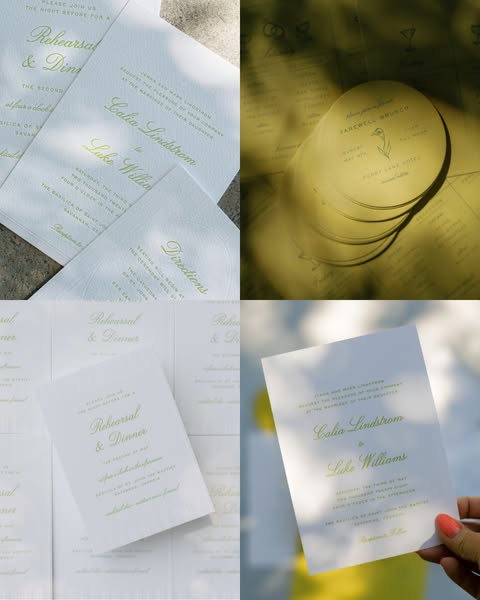
# Ad summary
This ad showcases a variety of wedding stationary, including invitations, rehearsal dinner invites, and farewell brunch menus. The design is simple and elegant, with a focus on high-quality paper and classic typography.
# Brand positioning
This ad does not explicitly showcase a brand. The focus is on the design and quality of the wedding stationery itself, suggesting a brand that values elegance, simplicity, and attention to detail. The brand aims to occupy a space in the consumer's mind as a provider of high-end, classic wedding stationery. The brand aligns with values of sophistication and timelessness, ignoring trends in favor of a refined aesthetic. The brand positioning is emotional, focusing on the importance of the occasion and the desire for beautiful, memorable stationery.
# Product
The featured products are wedding stationery items, including invitations, rehearsal dinner invitations, and farewell brunch menus. The stationery is printed on high-quality white paper with a simple, elegant design. The text is in a classic, slightly cursive font, and the color is a muted green. The invitations include the names of the couple, the date and time of the wedding, and the location. The rehearsal dinner invitations include similar information for the rehearsal dinner. The farewell brunch menus are round and include a floral design. The products are for couples who are planning a wedding and want elegant, high-quality stationery. The ad addresses the purchase barrier of finding stationery that is both beautiful and timeless.
# Visual style
The ad has a clean and elegant visual style. The production quality is high, with a focus on natural lighting and soft colors. The image treatment includes a slight blurring effect to create a sense of depth. The typography is classic and understated, and the overall aesthetic is timeless and sophisticated. The ad mimics a high-end editorial style, which may impact scannability but increases stop power in feed.
# Hooks
Headline: None used
# Funnel stage
Middle of funnel (Consideration)
# Pain points
None used.
# Call to action
None used.
# Point of view
- Brand: The overall presentation of the stationery and the focus on design and quality suggest the brand's perspective.
- Customer: The close-up view of the invitation being held in a hand suggests the customer's perspective.
# Storyline
- The ad opens with a collection of wedding stationery, including invitations and rehearsal dinner invites. This is intended to showcase the variety of options available, from the brand's perspective.
- The ad then shows a stack of round farewell brunch menus. This highlights the attention to detail and the comprehensive nature of the stationery offerings, from the brand's perspective.
- Finally, the ad shows a hand holding a wedding invitation, with the names of the couple and the wedding details visible. This provides a close-up view of the design and quality of the stationery, from the customer's perspective.
# Ad summary
This ad for Minted features a woman and her daughter creating and decorating Valentine’s Day cards with a cats and dogs theme. The mother discusses how Minted always makes their Valentines extra sweet.
# Brand positioning
Minted is presented as a service that provides customers with unique, customizable Valentine’s Day cards and stickers. The brand is positioned as being family-friendly, facilitating memorable crafting activities for parents and children. Minted offers products that are more personalized than typical store-bought cards, with the ability to add personal photos, names, and even a Tic-Tac-Toe game on the back. Minted caters to customers who appreciate adding a personal touch to their holiday cards by showcasing how users can customize and create keepsakes. Their products stand out from the competition by encouraging customization.
# Product
The advertised product is Valentine’s Day cards and stickers from Minted’s Disney collection. The cards feature characters from Disney movies and can be personalized with individual names and photos. The ad mentions the option to add fun games to the back of the cards, like Tic-Tac-Toe. Stickers are also available with the same cat and dog characters, personalized with names. These stickers can be used to seal envelopes and add extra detail to the Valentine’s Day cards. The ad highlights that these are more than just cards, and offers a complete personalized package for Valentine's Day that can be used in family activities. Minted presents their Valentine's cards as providing a way for families to create something unique and memorable for their loved ones.
# Visual style
The ad has a polished and bright aesthetic, using soft lighting and a consistent pink color palette to create a warm and inviting tone. The editing style consists of smooth transitions and static shots, with a moderate pacing that allows viewers to take in each visual detail. The use of overhead shots and close-ups on products helps to highlight key features and designs, timed with the voiceover to create audio-visual sync. Overall, the production quality is high, with a focus on showcasing the products in a visually appealing manner.
# Hooks
Spoken: 00:00–00:04 Female 1: One of my favorite traditions with kids is choosing our Valentine cards from Minted.
Visual: 00:00–00:01 Medium shot of a fair-skinned, blonde-haired woman wearing a pink short-sleeved sweater sitting at a table across from a young fair-skinned, blonde-haired girl with a white bow in her hair. They are looking at Valentine’s Day cards. The table has a pink tablecloth with a pattern of bows. A bouquet of light pink flowers is visible in the background, sitting on a white cabinet. On the wall is a gold-framed mirror and a pink and white banner. The camera is stationary. / 00:01–00:02 Close up of the young girl holding up a card with a photo of a girl on it and smiling. The background is the same as the previous shot. The camera is stationary. / 00:02–00:03 Close up of hands holding several green cards that read, “You’re PURR-fectly ADORABLE XOXO” with a picture of Marie, a cartoon white cat. The background is light pink. The camera is stationary. / 00:03–00:04 Different angle of the close up of hands holding several green cards that read, “You’re PURR-fectly ADORABLE XOXO” with a picture of Marie, a cartoon white cat. The background is light pink. The camera is stationary.
# Funnel stage
Top of funnel (Awareness)
# Pain points
None used.
# Value propositions
- Personalized cards make Valentines extra sweet
# Benefits
- Makes Valentines extra sweet
- A fun tradition with kids
# Features
- Personalized cards
- Personalized stickers
- Photo cards
- Fun games you can add to the back
# Call to action
None used.
# Social proof
- “I love how these turned out and Minted always makes our Valentines extra sweet.” – Female 1 (Customer)
# Point of view
- Customer 100% – The entire ad is told from the perspective of a mother sharing her family tradition and experience with the brand.
# Storyline
- 00:00–00:04 00:00–00:04 The mother sits at a table with her daughter, holding Minted Valentine's Day cards and discussing how they choose their Valentine cards from Minted as one of her favorite traditions with her kids. The perspective is from the mother, as she describes their tradition of selecting cards from Minted. The tone is warm and inviting, framing the brand as a facilitator of cherished family moments.
- 00:04–00:09 00:04–00:09 The mother showcases various Valentine’s Day cards and accessories from Minted with a cats and dogs theme, including stickers and plush animal toys tied to the cards with ribbons. This demonstrates Minted's range of personalized options, highlighting how they offer themed sets featuring characters from the Disney collection.
- 00:09–00:14 00:09–00:14 A child seals an envelope with a personalized sticker and the mother shows a photo card and a Tic-Tac-Toe game on the back of a card. This emphasizes the customizable features offered by Minted and how easy they are to use. The POV shifts to a demonstration of the product's features, showing the personalized aspects.
- 00:14–00:17 00:14–00:17 The mother and daughter play a game on the cards and the mother showcases personalized stickers. This further highlights the interactive and personalized elements of the Minted cards, reinforcing the message of unique customization.
- 00:17–00:22 00:17–00:22 The mother and daughter each hold up a toy and a personalized card. The mother shares how much she loves the cards and says that Minted always makes their Valentines extra sweet. The tone is appreciative, reinforcing Minted's ability to elevate the holiday experience.
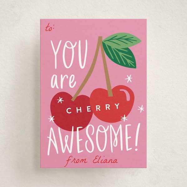
# Ad summary
An image advertisement featuring illustrated cherries along with text that tells the user that they are cherry awesome.
# Brand positioning
The brand's positioning is not explicitly stated in the ad; however, the ad leverages an emotional and playful tone. The brand is aiming to evoke feelings of fun and caring through the use of an illustrated image and playful copy.
# Product
The featured product is a greeting card that is meant to be given from one person to another. The greeting card features the message that they are cherry awesome. This message is meant to convey a lighthearted, fun, caring sentiment.
# Visual style
The ad uses a simple, flat, illustrative style with a limited color palette. The production quality appears clean and crisp, suggesting a professionally designed image. The visual motif is an illustration of cherries, giving the ad a playful and cheerful aesthetic.
# Hooks
Headline: YOU are AWESOME!
# Funnel stage
Top of funnel (Awareness)
# Pain points
None used.
# Call to action
None used.
# Social proof
- None used.
# Point of view
- Brand: The overall image conveys the brand's message that the card is meant to be given by someone to express positive feelings.
# Storyline
- The ad conveys a friendly, positive, and encouraging message. It is told from the perspective of someone who cares about the recipient and wants to express their appreciation.
# Ad summary
This ad for Minted promotes their new wedding invitations. The ad uses a grid effect to reveal the wedding invitation. The color scheme for the ad is muted with pink and neutral colors.
# Brand positioning
Minted is presented as a modern brand providing elegant and customizable stationery, invitations, and art. The brand emphasizes design and offers a curated marketplace connecting customers with independent artists. Minted caters to those who value unique and high-quality design for special occasions, particularly weddings.
# Product
Minted is advertising its new line of wedding invitations. These invitations are customizable and designed with unique designs. The ad focuses on the aesthetic appeal and elegant design of the invitations, highlighting them as a way to make a lasting impression. The invitation designs vary in color and shape.
# Visual style
The ad has a polished and elegant aesthetic with a focus on clean lines and muted colors. The editing style uses smooth transitions and a dynamic grid effect to reveal the wedding invitations. The production quality is high-end, giving a sophisticated feel. The pacing is moderate, with visual elements timed to the music, creating a cohesive audiovisual experience.
# Hooks
Text overlay: NEW
Visual: 00:00–00:01: A grid of 16 squares in different shades of neutral tones. In the bottom row, four different wedding invitations with varying designs are shown.
# Funnel stage
Top of funnel (Awareness)
# Pain points
None used.
# Value propositions
- Make a lasting impression with unique and high-quality wedding invitations.
- Elegant, customizable wedding invitations from Minted.
# Benefits
- Unique, high-quality stationery
- Elegant wedding invitations
# Features
- Customizable designs
- Elegant aesthetic
# Call to action
None used.
# Social proof
- None used.
# Point of view
- Brand 100% – The ad is told from the brand's official perspective, showcasing its product range and aesthetic.
# Storyline
- 00:00–00:01 The ad begins with a grid of squares in various neutral shades.
- 00:01–00:04 00:01–00:04: The squares in the grid rotate to reveal different wedding invitation designs, creating a mosaic effect. The focus is on showcasing the variety and elegance of the invitations.
- 00:04–00:06 00:04-00:06: The squares come together to form a complete image of a wedding invitation inside an envelope. Text appears indicating that these are "New Wedding invitations" from Minted.
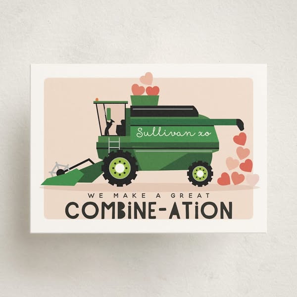
# Ad summary
This image ad shows an illustration of a combine harvester releasing hearts instead of grain, with the text "WE MAKE A GREAT COMBINE-ATION". It's a playful, Valentine's Day-themed greeting card that uses a pun to convey a message of love and togetherness.
# Brand positioning
This ad presents a greeting card brand that specializes in unique and playful designs, moving away from traditional sentimental cards. The brand appeals to individuals with a sense of humor and an appreciation for clever puns, positioning itself as a source for memorable and lighthearted expressions of affection.
# Product
This is a greeting card featuring an illustration of a green combine harvester. Hearts instead of grain are coming out of the combine's unloading auger. The message says “WE MAKE A GREAT COMBINE-ATION.” The card appears to be made of white paper stock and is blank on the inside for a personalized message. The product is presented as a unique and fun way to express affection. The pun in the card title addresses the barrier of finding a creative expression of one's feelings.
# Visual style
The ad has a clean, minimalist visual style with a flat illustration of a combine harvester. The image uses a limited color palette of green, tan, white, red, and pink, creating a soft and inviting aesthetic. The design is simple and avoids gradients or complex shading, lending a playful tone.
# Hooks
Headline: WE MAKE A GREAT COMBINE-ATION
# Funnel stage
Top of funnel (Awareness)
# Pain points
None used.
# Call to action
None used.
# Social proof
- None used.
# Point of view
- Brand: The brand is presenting a playful and unique greeting card design, using a clever pun to capture the audience's attention.
- Customer: The card expresses a sentiment that two individuals are a great match.
# Storyline
- From a graphic perspective, a playful visual of a combine is shown with hearts being released. The message conveyed is that this is a humorous and unique way to express affection. This is the brand showing its unique take on greeting cards.
- From a text perspective, the audience is being told that this card is a great way to express the sentiment that two individuals are a great match. The perspective is from the card/brand, suggesting this is the perfect way to say 'I love you' with a witty pun.
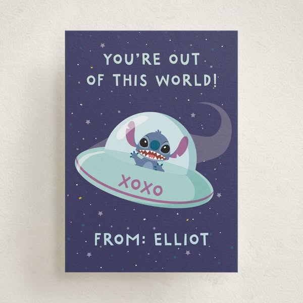
# Ad summary
This image ad features an illustration of Stitch in a spaceship with the headline "You're out of this world!" and is signed "From: Elliot."
# Brand positioning
This ad is for a customizable card or stationery product, likely part of a broader e-commerce platform offering a range of personalized items. The ad emphasizes a lighthearted, sentimental connection, positioning the brand as a provider of unique and customizable greetings. It deviates from generic, mass-produced cards by offering a personalized touch, aligning with a customer base that values individualized and heartfelt expressions. The brand's tone is playful and affectionate, aiming for emotional resonance over functional superiority.
# Product
The product being advertised is a personalized card, likely intended for Valentine's Day or a similar occasion expressing affection. The card features a navy blue background with a white and light blue spaceship containing the character Stitch. The spaceship has the text "XOXO" in pink. The card is designed to be given from someone named Elliot, as indicated by the text "FROM: ELLIOT." The card's design and the ability to personalize it make it a unique and heartfelt alternative to generic greeting cards, appealing to customers who want to add a personal touch to their expressions of love or friendship.
# Visual style
The ad features a clean, whimsical, and cartoon-like visual style. The production quality appears polished, with a flat, graphic illustration style. The image treatment includes a cohesive color scheme of navy blue, white, light blue, and pink, creating a visually appealing and harmonious design. The overall aesthetic is child-like and fun.
# Hooks
Headline: YOU'RE OUT OF THIS WORLD!
# Funnel stage
Top of funnel (Awareness)
# Pain points
None used.
# Value propositions
- The card offers a unique design with Stitch in a spaceship.
- The card is personalized with the name Elliot.
# Call to action
None used.
# Social proof
- None used.
# Point of view
- Brand: The entire ad presents a brand-driven narrative, showcasing how their personalized card can convey affectionate and unique messages.
# Storyline
- The ad opens with the message "YOU'RE OUT OF THIS WORLD!", setting a tone of admiration and endearment. The brand is playfully conveying a compliment, positioning the card as a way to express special feelings to someone special.
- The focal point shifts to Stitch sitting inside of a spaceship. The customer is visually experiencing a cute and whimsical design. This aims to connect emotionally with the viewer and show the card's unique visual appeal.
- The inclusion of "XOXO" reinforces the card's purpose as an expression of love or affection, appealing to the recipient through a clear expression of sentiment. The brand wants to enhance the card’s message by emphasizing the loving intention.
- The card concludes with "FROM: ELLIOT", revealing the card is personalized and creating a sense of intimacy and individuality. The brand is communicating a personalized connection to the recipient.
# Ad summary
This ad showcases a variety of wedding invitations from the brand, highlighting different designs and styles. The ad uses a fast-paced editing style with upbeat music to capture the viewer's attention and showcase the range of options available.
# Brand positioning
The brand is presented as a provider of high-quality, customizable wedding invitations. The brand aims to occupy a space in the consumer's mind as a go-to for elegant and personalized wedding stationery. The brand aligns with values of sophistication, attention to detail, and the celebration of love and commitment. The brand seems to ignore the trend of digital invitations, focusing instead on the traditional and tactile experience of physical invitations. The brand positioning is both functional (offering a variety of designs and customization options) and emotional (evoking feelings of excitement and anticipation for the wedding day).
# Product
The featured product is a range of wedding invitations, each with unique designs, colors, and fonts. The invitations are for couples planning their wedding and seeking elegant, personalized stationery. The ad showcases various design details, including floral patterns, monograms, and different paper textures. The USPs include the variety of designs and the ability to customize the invitations to match the couple's style. The use occasions are for sending out wedding invitations to guests. The ad addresses the purchase barrier of finding the perfect invitation by showcasing a wide range of options. The invitations are presented as a way to make a lasting impression and set the tone for the wedding day.
# Visual style
The ad has a polished and elegant aesthetic, with a focus on showcasing the details of the wedding invitations. The editing style is fast-paced, with quick cuts between different shots. The production quality is high-end, with soft lighting and attention to detail. The pacing is quick, with cuts every 1-2 seconds, creating a sense of excitement and energy. The audio-visual sync is not particularly strong, but the music complements the visuals.
# Hooks
Text overlay: 00:00–00:03: SNEAK PEEK / 00:00–00:03: NEW INVITATIONS
Visual: 00:00–00:01: Close-up shot of a multi-tiered wedding cake. The cake is decorated with white frosting, gold leaf accents, and white flowers. A small, detailed cat figurine is placed on the side of the cake. The background is dark and out of focus. The lighting is soft and highlights the cake's details. The camera is stationary, providing a detailed view of the cake. / 00:01–00:01: A burgundy screen with the text "SNEAK PEEK" in white font. The background is a solid, dark red color. The text is centered and in a simple, sans-serif font. The lighting is even, making the text clear and readable. The camera is stationary, focusing on the text. / 00:01–00:02: Close-up shot of a wedding invitation inside a blue envelope. The invitation has a burgundy background with white text. The envelope has a patterned interior. The background is a light, neutral color. The lighting is soft and highlights the invitation's details. The camera is stationary, providing a detailed view of the invitation. / 00:02–00:03: Wide shot of a wedding venue. The venue has white pillars and floral decorations. The background is a lush garden. The lighting is bright and natural. The camera is stationary, capturing the venue's beauty.
# Funnel stage
Top of funnel (Awareness)
# Pain points
None used.
# Call to action
None used.
# Social proof
- None used.
# Point of view
- Brand 100% – The entire video is presented from the brand's perspective, showcasing their products and designs.
# Storyline
- 00:00–00:01 00:00–00:01: A close-up shot of a wedding cake with white frosting, gold leaf accents, and white flowers is shown. A small cat figurine is placed on the side of the cake. This shot is intended to create a sense of anticipation and excitement for a wedding event. The perspective is from an external observer, showcasing the cake's details. The tone is elegant and celebratory.
- 00:01–00:01 00:01–00:01: A burgundy screen with the text "SNEAK PEEK" in white font appears. This is meant to build anticipation for what is coming next. The perspective is from the brand, teasing the audience. The tone is mysterious and intriguing.
- 00:01–00:02 00:01–00:02: A close-up shot of a wedding invitation inside a blue envelope is shown. The invitation has a burgundy background with white text. This shot is intended to showcase the product and its design. The perspective is from an external observer, focusing on the invitation's details. The tone is elegant and sophisticated.
- 00:02–00:03 00:02–00:03: A wide shot of a wedding venue with white pillars and floral decorations is shown. This shot is intended to evoke the atmosphere of a wedding. The perspective is from an external observer, capturing the venue's beauty. The tone is romantic and celebratory.
- 00:03–00:04 00:03–00:04: A burgundy screen with the text "NEW INVITATIONS" in white font appears. This is meant to introduce the product category. The perspective is from the brand, announcing the new collection. The tone is informative and exciting.
- 00:04–00:05 00:04–00:05: A close-up shot of a wedding invitation with a floral design and arched shape is shown. The invitation has a white background with colorful floral illustrations and red text. This shot is intended to showcase the product and its design. The perspective is from an external observer, focusing on the invitation's details. The tone is elegant and sophisticated.
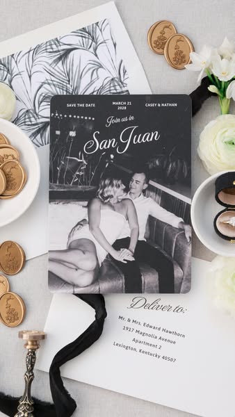
# Ad summary
This ad features a flatlay product shot of a wedding invitation. The invitation is black and white and features a photo of the couple. The text on the invitation reads "Save the Date," "March 21, 2028," "Casey & Nathan," and "Join us in San Juan." The invitation is surrounded by other wedding-related items, such as a white envelope, wax seals, and flowers.
# Brand positioning
This ad does not explicitly showcase a brand. Instead, it focuses on a specific event: a wedding. The ad promotes the idea of a destination wedding in San Juan, positioning it as a romantic and memorable experience. The use of elegant stationery and classic design elements suggests a sophisticated and timeless aesthetic. The brand, if any, aligns with values of love, commitment, and celebration, aiming to create a sense of excitement and anticipation for the upcoming event.
# Product
The featured product is a "Save the Date" wedding invitation. It is a rectangular card with rounded corners, featuring a black and white photograph of the couple. The invitation includes key details such as the date (March 21, 2028), the names of the couple (Casey & Nathan), and the location (San Juan). The design is classic and elegant, with a focus on clear typography and a romantic image. The invitation aims to inform guests of the upcoming wedding and encourage them to mark their calendars. The invitation is accompanied by a white envelope addressed to the recipients, adding a personal touch.
# Visual style
The ad features a clean and elegant visual style with a focus on classic design elements. The use of black and white photography and elegant stationery creates a sophisticated and timeless aesthetic. The flatlay arrangement and soft lighting add a touch of modernity and visual appeal. The overall style is polished and refined, conveying a sense of luxury and attention to detail.
# Hooks
Headline: Join us in San Juan
# Funnel stage
Top of funnel (Awareness)
# Pain points
None used.
# Value propositions
- Destination wedding in San Juan
- Elegant and memorable celebration
# Benefits
- Informs guests of the upcoming wedding
- Encourages guests to mark their calendars
- Creates anticipation for the event
# Features
- Save the Date
- March 21, 2028
- Casey & Nathan
- San Juan
# Call to action
None used.
# Social proof
- None used.
# Point of view
- Brand: The entire image is presented from the brand's perspective, showcasing the wedding invitation and related items in an aesthetically pleasing arrangement.
# Storyline
- The ad opens with a flatlay arrangement of wedding-related items, including the invitation, envelope, wax seals, and flowers. This sets the scene and introduces the theme of the ad from the brand's perspective, which is to promote the wedding.
- The focus shifts to the wedding invitation, highlighting the key details such as the date, names, and location. This informs the audience about the event and creates anticipation from the brand's perspective.
- The ad concludes with a view of the addressed envelope, adding a personal touch and emphasizing the importance of the recipients. This reinforces the invitation's purpose and encourages attendance from the brand's perspective.
# Ad summary
This ad showcases a variety of wedding invitations and related products, highlighting different styles and designs. It aims to inspire viewers with options for their own wedding stationery.
# Brand positioning
The brand is presented as a provider of high-quality, customizable wedding stationery and related products. It aims to occupy a space in the consumer's mind as a source of elegant and personalized wedding designs. The brand aligns with values of sophistication, attention to detail, and creating memorable moments. It pushes against generic, mass-produced wedding stationery by offering unique and customizable options. The brand positioning is both functional (offering a variety of designs and customization options) and emotional (helping couples create a perfect and memorable wedding experience).
# Product
The featured products are wedding invitations and related stationery items. These include save-the-date cards, wedding invitations, and thank you cards. The products are for couples planning their wedding and seeking personalized and high-quality stationery. The ad showcases various designs, colors, and styles, from classic and elegant to modern and whimsical. The USPs include customizable designs, high-quality materials, and attention to detail. The use occasions are wedding planning and preparation. The ad addresses the purchase barrier of generic or impersonal wedding stationery by offering unique and customizable options. The ad tells the viewer that these products are worth trying or buying because they offer a way to create a personalized and memorable wedding experience.
# Visual style
The ad has a polished and elegant aesthetic, with a focus on showcasing the details of the wedding stationery and venues. The editing style is characterized by quick cuts and static shots, creating a sense of anticipation and excitement. The production quality is high, with attention to lighting and composition. The pacing is fast, with cuts occurring every 1-2 seconds, maintaining a consistent rhythm throughout the ad. The visuals are timed to the music, enhancing the overall impact.
# Hooks
Text overlay: 00:01–00:02: SNEAK PEEK
Visual: 00:00–00:01: A close-up shot of a multi-tiered wedding cake. The cake is white with textured frosting, decorated with white flowers, gold leaf accents, and a small dog figurine. The background is dark and out of focus. The camera is stationary, and the lighting is soft, highlighting the details of the cake.
# Funnel stage
Top of funnel (Awareness)
# Pain points
The ad addresses the pain point of generic or impersonal wedding stationery.
# Value propositions
- Create a personalized and memorable wedding experience with customizable and high-quality stationery.
# Benefits
- Personalized wedding stationery
- Memorable wedding experience
- Elegant and sophisticated designs
# Features
- Customizable designs
- High-quality materials
- Variety of styles
# Call to action
None used.
# Social proof
- None used.
# Point of view
- Brand 100% – The ad presents the brand's products and aesthetic through curated visuals and text overlays.
# Storyline
- 00:00–00:01 00:00–00:01: A close-up shot of a wedding cake decorated with white flowers and gold leaf.
- 00:01–00:02 00:01–00:02: A burgundy screen with the text "SNEAK PEEK" in white.
- 00:02–00:03 00:02–00:03: A blue envelope with a wedding invitation inside is shown on a white surface.
- 00:03–00:04 00:03–00:04: A shot of a wedding venue with stone arches and white floral arrangements.
- 00:04–00:05 00:04–00:05: A burgundy screen with the text "NEW INVITATIONS" in white.
- 00:05–00:06 00:05–00:06: A wedding invitation with floral designs and a green envelope are shown on a white surface.
# Ad summary
This ad features a woman sharing four tips for creating a wedding website using Minted. She highlights the video header, color customization, bridal party page, and love story features.
# Brand positioning
Minted is presented as a user-friendly platform for creating wedding websites and coordinating stationery. The brand emphasizes free website options with numerous designs, suggesting accessibility and variety. By showcasing customizable features like color matching and bridal party pages, Minted positions itself as a modern, personalized solution for wedding planning, catering to couples who value aesthetics and ease of use. The brand aligns with a lifestyle focused on celebration and attention to detail, pushing against generic or impersonal wedding planning approaches.
# Product
Minted offers free wedding websites with customizable features. The platform allows users to add a video header for maximum impact, customize colors using a hex color code finder, create a bridal party page to introduce the wedding party to guests, and share the couple's love story. These features are designed to make the wedding website personal and engaging for guests. The ad addresses the potential barrier of cost by highlighting that the websites are free, making it an accessible option for couples planning their wedding.
# Visual style
The ad has a polished UGC feel, with a clean and bright aesthetic. The editing style is simple, with static shots and smooth transitions. The pacing is consistent, with a moderate number of cuts per minute. The visuals are timed to the voiceover, emphasizing key points.
# Hooks
Spoken: 00:00–00:03 I just got my save the dates from Minted and I'm so obsessed with how they turned out.
Visual: 00:00–00:03 A woman with long, dark hair stands in front of a white wall and a dark cabinet. She wears a white long-sleeved shirt and holds up three wedding stationery items: a white invitation with a drawing of a building, a sage green envelope, and a white laser-cut gatefold. She smiles and looks directly at the camera.
# Funnel stage
Consideration
# Pain points
The ad addresses the potential pain point of creating a wedding website that is both personalized and affordable. The speaker highlights that Minted websites are "completely free" and offer "so many designs that you're going to love," suggesting that users can achieve a high-quality, customized website without incurring costs.
# Value propositions
- Free wedding websites with customizable designs
- Video header for maximum impact
- Bridal party page to introduce the wedding party to guests
- Love story section to add a personal touch
# Benefits
- Easy to create a wedding website
- Personalized and engaging for guests
- Free and accessible option
- Adds a personal touch
# Features
- Free wedding websites
- Customizable designs
- Video header option
- Hex color code finder
- Bridal party page
- Love story section
# Call to action
Check out Minted for your wedding website and all of your coordinating stationery.
# Social proof
- "I just got my save the dates from Minted and I'm so obsessed with how they turned out" – Female 1 (Customer)
# Point of view
- Customer 100% – The entire video is presented from the perspective of a customer sharing her experience and tips.
# Storyline
- 00:00–00:04 The woman introduces herself and expresses excitement about her Minted save-the-dates.
- 00:04–00:08 She transitions to discussing her wedding website, mentioning she uses Minted because it's free and offers many designs.
- 00:08–00:12 She introduces her first tip: using a video header on the wedding website.
- 00:12–00:19 She shows an example of a custom illustration matching her save-the-dates but suggests a video for maximum impact.
- 00:19–00:22 She introduces her second tip: customizing colors on the website.
- 00:22–00:25 She explains that Minted makes it easy to find your color with the hex color code finder.
- 00:25–00:27 She introduces her third tip: creating a bridal party page.
- 00:27–00:32 She explains that this page is a fun way for guests to get to know the bridesmaids and groomsmen.
- 00:32–00:35 She introduces her fourth tip: sharing your love story.
- 00:35–00:41 She explains that writing about how you met and the proposal adds a personal touch.
- 00:41–00:46 She concludes by recommending Minted for wedding websites and coordinating stationery.
# Ad summary
This ad showcases Minted + Brides' wedding color of the year, Island Citrus, through various wedding elements like invitations, table settings, and wedding scenes.
# Brand positioning
Minted + Brides is presented as a sophisticated and stylish brand specializing in wedding-related products and services. The brand aims to occupy a space in the consumer's mind as a trendsetter in the wedding industry, particularly in color palettes and design aesthetics. The brand aligns with values of elegance, modernity, and attention to detail, promoting a lifestyle of refined taste and celebration. Minted + Brides pushes against category norms by focusing on unique color trends and curated design elements, setting itself apart from more traditional or generic wedding suppliers. The brand positioning is both functional (providing wedding essentials) and emotional (enhancing the joy and aesthetic appeal of the wedding experience).
# Product
The featured product is the 'Island Citrus' wedding color palette, which is presented as Minted + Brides' wedding color of the year. This color palette is showcased through various wedding elements, including invitations, table settings, and floral arrangements. The color is a soft, muted yellow-green, evoking a sense of freshness and sophistication. The product is for couples planning their wedding and looking for a modern and stylish color scheme. The ad highlights the versatility of the color, showing how it can be incorporated into different aspects of the wedding, from stationery to decor. The USP is its trendsetting status as the 'wedding color of the year,' suggesting that it is a fashionable and desirable choice. The ad addresses the purchase barrier of indecision by offering a curated color palette that simplifies the wedding planning process. The ad tells the viewer that this product is worth trying because it offers a contemporary and cohesive aesthetic for their special day.
# Visual style
The ad has a polished and elegant aesthetic, with a focus on soft lighting and natural colors. The editing style is smooth, with static shots and gentle transitions. The production quality is high-end, resembling a commercial. The visual motif is the consistent use of the 'Island Citrus' color palette across various wedding elements. The pacing is moderate, with cuts timed to showcase different aspects of the wedding theme.
# Hooks
Text overlay: 00:00–00:03 / WEDDING COLOR OF THE YEAR
Visual: 00:00–00:03 Close-up shot of a wedding invitation with gold lettering on a light-colored paper. The background is a soft, blurred yellow-green. The invitation is partially obscured by a textured, organic shape, creating a sense of depth. The lighting is soft and diffused, highlighting the texture of the paper. The camera is stationary, focusing on the details of the invitation. Text on the invitation reads 'Please join us for the wedding of Sydney Williams and Lemma Durden, Saturday, October 18th, 2028, six o'clock in the evening, Casa de Monte Plaza, Palm Springs, CA, dinner and dancing to follow.'
# Funnel stage
Top of funnel (Awareness)
# Pain points
The ad addresses the pain point of indecision in wedding planning by offering a curated color palette that simplifies the process. The visual of various wedding elements in a cohesive color scheme signals the frustration of coordinating different aspects of the wedding.
# Value propositions
- Trendsetting status as the 'wedding color of the year'
- Curated color palette simplifies wedding planning
- Contemporary and cohesive aesthetic for your special day
# Benefits
- Modern and stylish wedding aesthetic
- Cohesive color scheme
- Trendsetting design
# Features
- Island Citrus color palette
- Wedding invitations
- Table settings
- Floral arrangements
# Call to action
EXPLORE NOW
# Social proof
- None used.
# Point of view
- Brand 100% – The entire ad is presented from the official voice of Minted + Brides, showcasing their product and aesthetic.
# Storyline
- 00:00–00:03 00:00–00:03 The ad opens with a close-up shot of a wedding invitation featuring the 'Island Citrus' color palette. The message conveyed is to introduce the featured color and its application in wedding stationery. The perspective is from the brand, showcasing its design expertise and trendsetting status. The tone is elegant and sophisticated, setting the stage for a stylish wedding theme. This moment progresses the narrative by establishing the central theme of the ad.
- 00:03–00:05 00:03–00:05 The ad transitions to shots of wedding table settings, including menus and place cards, all incorporating the 'Island Citrus' color. The message is to demonstrate the color's versatility in wedding decor. The perspective is from the brand, showcasing its ability to create a cohesive wedding aesthetic. The tone remains elegant and refined, emphasizing the attention to detail. This moment builds on the previous one by expanding the application of the color palette.
- 00:05–00:09 00:05–00:09 The ad shows split-screen shots of wedding scenes (a couple walking, a couple dancing) and table settings featuring the 'Island Citrus' color. The message is to connect the color palette with real-life wedding moments and experiences. The perspective alternates between the brand showcasing its product and the couple enjoying their special day. The tone is joyful and celebratory, highlighting the emotional aspect of weddings. This moment reinforces the previous ones by showing the color palette in action.
- 00:09–00:13 00:09–00:13 The ad concludes with a solid 'Island Citrus' background, the Minted Weddings logo, and a call to action to 'Explore Now.' The message is to prompt viewers to visit the Minted Weddings website and explore their offerings. The perspective is from the brand, directly addressing the viewer with a clear call to action. The tone is direct and inviting, encouraging immediate engagement. This moment provides closure to the narrative by guiding the viewer towards the next step.
# Ad summary
This ad promotes Minted's wedding stationery and website services. The ad showcases how customers can match their wedding stationery to their wedding website using Minted's services.
# Brand positioning
Minted is presented as a modern and design-focused brand that specializes in wedding stationery and website services. The brand aims to occupy the space of providing cohesive and aesthetically pleasing wedding planning solutions. Minted aligns with values of elegance, personalization, and attention to detail, promoting a lifestyle of sophisticated celebration. The brand pushes against the norm of generic, mismatched wedding materials by offering a seamless matching experience between stationery and websites. The brand positioning is both functional (providing matching services) and emotional (creating a beautiful and memorable wedding experience).
# Product
The featured product is Minted's service that allows customers to match their wedding stationery to their wedding website. This service ensures a cohesive and aesthetically pleasing look for all wedding-related materials. The product is for couples planning their wedding who want a seamless and personalized experience. The ad highlights the ability to create a unified design across both digital and physical elements of the wedding. The USP is the matching design, ensuring consistency and elegance. The use occasion is during the wedding planning process. The ad addresses the purchase barrier of mismatched or disjointed wedding materials by offering a solution for a coordinated look. The ad tells the viewer that this product is worth trying because it simplifies wedding planning and enhances the overall aesthetic of the event.
# Visual style
The ad has a polished and elegant aesthetic, with soft lighting and a focus on design details. The editing style is smooth, with static shots and gentle pans. The production quality is high-end, resembling a commercial. The visual motif is the consistent floral design across all stationery elements. The pacing is slow and deliberate, allowing viewers to appreciate the details.
# Hooks
Text overlay: Match your stationery to your wedding website ✨✨
Visual: 00:00–00:01: A smartphone leans against a beige wall, displaying a wedding website with a photo of a couple in a mountain setting. The website includes the names "Anna Marie Benson and Edward Preston-Meyer" and the date "September 25, 2028."
# Funnel stage
Top of funnel (Awareness)
# Pain points
The pain point is the potential for mismatched or disjointed wedding materials, which can detract from the overall aesthetic of the event. The ad addresses this by offering a solution for a coordinated look.
# Value propositions
- Matching designs for a unified and elegant wedding aesthetic
# Benefits
- Cohesive and aesthetically pleasing wedding materials
- Simplified wedding planning
# Features
- Matching wedding stationery and website designs
# Call to action
None used.
# Social proof
- None used.
# Point of view
- Brand 100% – The ad is presented from the official voice of the brand, showcasing the product and its benefits.
# Storyline
- 00:00–00:01 The ad opens with a shot of a smartphone displaying a wedding website.
- 00:01–00:02 The scene transitions to a laptop showing the same wedding website.
- 00:02–00:10 The ad then shows a collection of wedding stationery, including invitations, RSVP cards, and envelopes, all matching the design of the website.
# Ad summary
This ad promotes wedding invitation templates from the brand Paperless Post. The ad features a variety of different invitation templates that are available on the platform.
# Brand positioning
Paperless Post is presented as a modern and stylish solution for creating and sending online invitations. The brand offers a wide variety of customizable templates for various occasions, with a focus on weddings in this ad. The brand aims to occupy the space of convenient and elegant digital communication, aligning with values of personalization and ease of use. It pushes against the traditional norms of paper invitations by offering a sustainable and efficient alternative.
# Product
Paperless Post offers digital invitation templates that can be customized and sent online. The product is for anyone looking for a modern, convenient, and eco-friendly way to send invitations, particularly for weddings. The ad showcases a variety of design templates, highlighting the platform's versatility and aesthetic appeal. The product addresses the purchase barriers of traditional paper invitations by offering a cost-effective and time-saving solution. The ad emphasizes the ease of use and the ability to create personalized invitations without the hassle of printing and mailing.
# Visual style
The ad has a clean and modern aesthetic with a focus on showcasing the design templates. The editing style is simple with static shots and smooth transitions. The production quality is polished, giving a professional and elegant feel. The pacing is consistent, allowing viewers to appreciate the variety of designs.
# Hooks
Visual: 00:00–00:03: A phone screen displays various wedding invitation templates. The background is a blurred image of mountains and sky. The templates feature different designs, colors, and fonts. The camera is static and focuses on the phone screen.
# Funnel stage
Top of funnel (Awareness)
# Pain points
None used.
# Call to action
None used.
# Social proof
- None used.
# Point of view
- Brand 100% – The ad is presented from the brand's perspective, showcasing the features and benefits of its product.
# Storyline
- 00:00–00:07 The ad opens with a display of various wedding invitation templates on a phone screen.
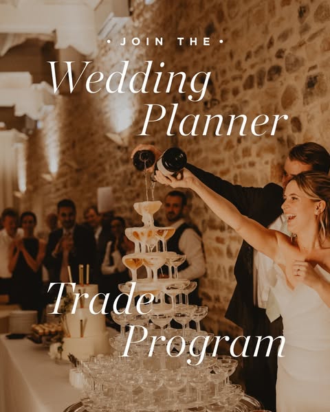
# Ad summary
This image ad is for a wedding planner trade program. It features a couple pouring champagne into a champagne tower at their wedding.
# Brand positioning
This ad does not explicitly mention a brand. However, the ad is for a wedding planner trade program, which implies that the brand is a wedding planning company. The brand is presented as being sophisticated and high-end, as evidenced by the elegant wedding setting and the champagne tower. The brand aims to occupy the space of a luxury wedding planner that can provide a dream wedding for their clients. The brand aligns with values of elegance, sophistication, and attention to detail. The brand ignores the category norm of budget-friendly weddings and instead focuses on creating a luxurious experience. The brand positioning is emotional, as it aims to create a feeling of happiness and joy for the couple on their wedding day.
# Product
The product being advertised is a wedding planner trade program. The program is for people who are interested in becoming wedding planners. The ad does not explicitly state the details of the program, but it implies that it is a comprehensive program that will teach people how to plan weddings. The ad also implies that the program is for people who are passionate about weddings and who want to help couples create their dream wedding. The ad addresses the purchase barrier of not knowing how to become a wedding planner by offering a program that will teach people everything they need to know.
# Visual style
The ad has a warm and inviting visual style. The lighting is soft and romantic, and the colors are muted. The overall effect is one of elegance and sophistication.
# Hooks
Headline: Wedding Planner
# Funnel stage
Top of funnel (Awareness)
# Pain points
None used.
# Value propositions
- None used
# Benefits
- None used
# Features
- Wedding Planner Trade Program
# Call to action
None used.
# Social proof
- None used.
# Point of view
- Brand: The text "Join the Wedding Planner Trade Program" is from the brand's point of view because it is a direct call to action.
# Storyline
- The ad opens with a shot of a couple pouring champagne into a champagne tower at their wedding. This is included to create a sense of elegance and sophistication. The audience is experiencing it from the perspective of an observer at the wedding.
- The ad then transitions to a shot of the text "Join the Wedding Planner Trade Program." This is included to inform the audience that the ad is for a wedding planner trade program. The audience is experiencing it from the perspective of the brand.
# Ad summary
This ad promotes the Wedding Planner Trade Program. It features a series of short clips showcasing wedding-related imagery, including a bride and groom embracing, wedding invitations, a bride having her dress tied, and a table setting. The ad aims to attract individuals interested in joining the program.
# Brand positioning
The brand is presented as being involved in the wedding industry, offering a Wedding Planner Trade Program. The brand aligns with values of elegance, romance, and professionalism, as suggested by the wedding imagery. The brand aims to occupy a space in the consumer's mind as a resource for those looking to enter or advance in the wedding planning industry. The brand positioning is functional, offering a program to help individuals succeed in the wedding planning business.
# Product
The Wedding Planner Trade Program is designed for individuals interested in becoming wedding planners or advancing their skills in the wedding industry. The program is not described in detail, but the ad implies it provides resources, training, and opportunities to succeed in the wedding planning business. The ad aims to attract individuals who are passionate about weddings and want to turn that passion into a career. The program is presented as a way to gain expertise and access to the wedding industry.
# Visual style
The ad has a polished and elegant aesthetic, with soft, natural lighting and smooth transitions. The production quality is high-end, creating a sophisticated and romantic tone. The pacing is slow and deliberate, with static shots that allow the viewer to focus on the details of the wedding imagery. The editing style is smooth, with seamless transitions between shots.
# Hooks
Text overlay: 00:00–00:09: JOIN THE / 00:00–00:09: Wedding Planner / 00:00–00:09: Trade / 00:00–00:09: Program
Visual: 00:00–00:02: A bride and groom embrace in an outdoor setting with soft, natural lighting. The bride is wearing a white wedding dress, and the groom is wearing a black suit. The background is blurred, creating a romantic atmosphere. Text overlay: "JOIN THE Wedding Planner Trade Program".
# Funnel stage
Top of funnel (Awareness)
# Pain points
The ad does not explicitly state a pain point, but it implies that individuals may struggle to enter or advance in the wedding planning industry without proper training and resources.
# Value propositions
- The Wedding Planner Trade Program offers a way to turn a passion for weddings into a career.
# Benefits
- Not explicitly stated, but implied benefits include gaining expertise and access to the wedding industry.
# Features
- Wedding Planner Trade Program
# Call to action
None used.
# Social proof
- None used.
# Point of view
- Brand 100% – The ad is presented from the brand's perspective, showcasing the Wedding Planner Trade Program and its association with elegant wedding imagery.
# Storyline
- 00:00–00:02 The ad opens with a shot of a bride and groom embracing, followed by a shot of wedding invitations.
- 00:03–00:05 The ad continues with shots of a bride having her dress tied and a table setting.
- 00:06–00:09 The ad concludes with a shot of a bride and groom walking hand in hand.
# Ad summary
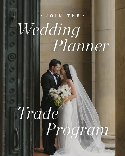
This image ad is for a wedding planner trade program. It features a bride and groom in front of a stone building.
# Brand positioning
This ad is for a wedding planner trade program. The brand is positioned as a resource for wedding planners, offering them a way to connect with other professionals in the industry. The brand promotes a sense of community and collaboration, suggesting that wedding planners can benefit from working together and sharing resources. The brand is functional, offering a practical solution for wedding planners looking to grow their businesses.
# Product
The product being advertised is a wedding planner trade program. This program is designed for wedding planners who are looking to connect with other professionals in the industry, share resources, and grow their businesses. The ad does not explicitly state the features of the program, but it implies that it offers a way for wedding planners to network, collaborate, and learn from each other. The ad also suggests that the program can help wedding planners to stay up-to-date on the latest trends and best practices in the industry. The ad does not mention any purchase barriers, but it implies that the program is a valuable investment for wedding planners who are serious about their careers.
# Visual style
The ad has a classic and elegant visual style, with a focus on the bride and groom. The image is well-lit and the colors are soft and muted, creating a romantic and sophisticated feel.
# Hooks
Headline: Wedding Planner
# Funnel stage
Top of funnel (Awareness)
# Pain points
None used.
# Value propositions
- None used
# Benefits
- None used
# Features
- Trade Program
# Call to action
None used.
# Social proof
- None used.
# Point of view
- Brand: The entire ad is presented from the brand's perspective, as it promotes the wedding planner trade program and invites viewers to join.
# Storyline
- The ad opens with a shot of a bride and groom, which immediately establishes the context of the ad as being related to weddings. This is from the brand's perspective, setting the scene and drawing the viewer in with a visually appealing image that is relevant to the target audience.
- The text overlay "Join the Wedding Planner Trade Program" then appears, which clearly communicates the purpose of the ad and the offer being made. This is from the brand's perspective, directly addressing the viewer and inviting them to participate in the program.
# Ad summary
A woman shows off her wedding invitation suite from Minted, including the formal invitation, details card, welcome party invitation, and RSVP card. She praises the quality of Minted's products and the seamless process of working with them.
# Brand positioning
Minted is presented as a high-quality stationery provider, specializing in wedding invitations and related products. The brand is positioned as offering elegant and customizable designs, with a focus on quality materials and a seamless customer experience. The ad implies that Minted is a go-to choice for couples seeking sophisticated and personalized wedding stationery, emphasizing the brand's ability to deliver unmatched quality and a stress-free design process. The brand aligns with values of elegance, personalization, and high-quality craftsmanship, catering to customers who prioritize attention to detail and a seamless experience in their wedding planning process. Minted pushes against the norm of generic, mass-produced wedding stationery by offering customizable designs and premium materials. The brand positioning is both functional (high-quality, customizable) and emotional (elegant, personalized).
# Product
The featured product is a wedding invitation suite from Minted, comprising several components: a formal invitation, a details card, a welcome party invitation, and an RSVP card. The formal invitation is described as a simple and elegant letterpress design. The details card is designed to complement the wedding's color scheme of sage green and blush pink, providing guests with essential information. The welcome party invitation features a tropical palm tree design, reflecting the destination wedding's theme. The RSVP card allows guests to respond to the welcome party and wedding day invitations. The suite is customizable, allowing couples to personalize their wedding stationery with high-quality materials and elegant designs. The ad emphasizes the unmatched quality of Minted's products and the seamless process of creating a personalized wedding invitation suite.
# Visual style
The ad has a polished UGC feel, with bright, natural lighting and a clean background. The editing style is simple, with static shots and smooth zooms. The production quality is high, giving the ad a professional look. The pacing is consistent, with a moderate number of cuts per minute. The audio-visual sync is smooth, with the visuals aligning with the voiceover.
# Hooks
Spoken: 00:00–00:03 It is time to reveal our wedding invites with you guys.
Text overlay: 00:03–00:08 WEDDING INVITATION SUITE REVEAL
Visual: 00:00–00:03 A woman with blonde hair, wearing a navy blue sweater and light-colored pants, stands in front of a light gray wall with a white door in the background. She is holding a light green envelope with white text on it. The camera is stationary and selfie-style, focusing on the woman and the envelope. The lighting is bright and natural. The woman is smiling and gesturing with her hands as she speaks.
# Funnel stage
Consideration
# Pain points
The ad implies that planning wedding stationery can be overwhelming and stressful. The creator highlights the seamless process of working with Minted, suggesting that it alleviates the stress of finding high-quality, customizable wedding invitations.
# Value propositions
- Best quality invite suites: Highlights the superior quality of Minted's products.
- Simple and elegant designs: Emphasizes the aesthetic appeal and sophistication of Minted's designs.
- Seamless process: Highlights the ease and convenience of working with Minted.
# Benefits
- Best quality invite suites
- Simple and elegant designs
- Seamless process
# Features
- Wedding invitation suite
- Formal invitation
- Details card
- Welcome party invitation
- RSVP card
- Letterpress designs
- Customizable designs
- High-quality materials
# Call to action
Highly recommend Minted.
# Social proof
- "I worked with Minted on our entire invite suite because I knew they would make the best quality invite suites" – Female 1 (Customer)
- "Quality of Minted is actually unmatched and again, the process was just so seamless" – Female 1 (Customer)
- "Highly recommend Minted. They did such an amazing job" – Female 1 (Customer)
# Point of view
- Customer 100% – The entire video is told from the perspective of a customer sharing her experience with the brand.
# Storyline
- 00:00–00:03 00:00–00:03 The creator holds up a light green envelope and announces that she will be revealing her wedding invitations. This is intended to grab the viewer's attention and introduce the topic of the video. The story is being told from the creator's perspective, sharing her excitement about the wedding invitations. The tone is enthusiastic and anticipatory.
- 00:03–00:08 00:03–00:08 The creator states that she worked with Minted on her entire invite suite because she knew they would make the best quality invite suites. This is intended to highlight the brand's expertise and quality. The story is being told from the creator's perspective, sharing her positive experience with the brand. The tone is confident and appreciative.
- 00:08–00:13 00:08–00:13 The creator shows the formal invitation, describing it as gorgeous. This is intended to showcase the design and quality of the invitation. The story is being told from the creator's perspective, sharing her admiration for the product. The tone is enthusiastic and complimentary.
- 00:13–00:17 00:13–00:17 The creator states that she chose one of Minted's simple and elegant letterpress designs. This is intended to highlight the brand's design aesthetic and quality. The story is being told from the creator's perspective, sharing her design preferences. The tone is appreciative and descriptive.
- 00:17–00:18 00:17–00:18 The creator introduces the wedding details card. This is intended to transition to the next item in the suite. The story is being told from the creator's perspective, sharing the contents of the suite. The tone is informative and anticipatory.
- 00:18–00:27 00:18–00:27 The creator explains that the wedding doesn't have exact wedding colors, but they are kind of like sage green and blush pink, and she wanted the detail card to pull everything together with the pink and the green. This is intended to explain the design choices and color scheme. The story is being told from the creator's perspective, sharing her design process. The tone is descriptive and explanatory.
- 00:27–00:30 00:27–00:30 The creator introduces the welcome party invitation, explaining that they are having a welcome party since it is a destination wedding. This is intended to transition to the next item in the suite and explain the event. The story is being told from the creator's perspective, sharing the wedding plans. The tone is informative and anticipatory.
- 00:30–00:37 00:30–00:37 The creator describes the welcome party invitation as more tropical and mentions that she chose the palm tree design. This is intended to highlight the design and theme of the invitation. The story is being told from the creator's perspective, sharing her design choices. The tone is descriptive and explanatory.
- 00:37–00:41 00:37–00:41 The creator introduces the RSVP cards and mentions that she tied in the green and the pink. This is intended to transition to the next item in the suite and highlight the color scheme. The story is being told from the creator's perspective, sharing her design choices. The tone is informative and explanatory.
- 00:41–00:46 00:41–00:46 The creator praises the quality of Minted and the seamless process. This is intended to reinforce the brand's value proposition. The story is being told from the creator's perspective, sharing her positive experience. The tone is enthusiastic and appreciative.
- 00:46–00:54 00:46–00:54 The creator states that she will be using Minted for more of her wedding stationery and highly recommends them. This is intended to encourage viewers to consider Minted for their own wedding stationery needs. The story is being told from the creator's perspective, sharing her recommendation. The tone is enthusiastic and persuasive.
How Other Lifestyle Brands Advertise on Meta
Peer brands in Motion's library — click any brand to see their creative strategy, live ads, and AI breakdowns.