
# Ad summary
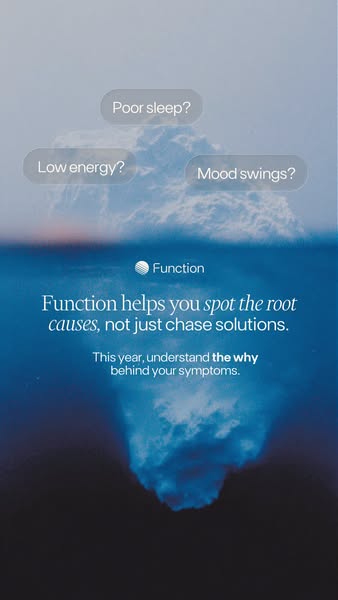
This ad identifies common symptoms that people experience, such as poor sleep, low energy, and mood swings, and suggests that Function can help identify the root causes of these issues rather than just treating the symptoms.
# Brand positioning
Function is presented as a brand that takes a comprehensive approach to wellness by addressing the root causes of health issues rather than merely chasing solutions. The brand positions itself as a guide to understanding the 'why' behind symptoms, suggesting a commitment to deeper, more meaningful solutions. This approach implies that Function values understanding and addressing underlying health concerns. The use of the iceberg imagery emphasizes that many health issues have underlying, less visible causes.
# Product
The ad promotes Function, a service that helps people identify the underlying causes of their health symptoms. The service addresses symptoms such as poor sleep, low energy, and mood swings, which are common wellness challenges. The ad suggests Function takes a holistic approach, focusing on understanding the 'why' behind symptoms rather than simply treating them. The image of an iceberg is used to represent that the apparent symptoms are just the tip of a deeper issue, implying the service goes beyond superficial solutions. The ad positions Function as a way to understand and address the root causes of these issues, rather than merely alleviating the symptoms.
# Visual style
The ad uses a clean, minimalist style with a focus on clarity and ease of understanding. The iceberg image is used to convey depth and hidden problems, visually representing the concept of addressing root causes rather than surface symptoms. The typography is simple and legible, promoting readability and quick comprehension. The color palette is limited to shades of blue and white, creating a calming and trustworthy feel. Overall, the visual style supports the brand's positioning of providing clarity and comprehensive solutions in the wellness space.
# Hooks
Headline: Function helps you spot the root causes, not just chase solutions.
# Funnel stage
Top of funnel (Awareness)
# Pain points
The ad highlights common health issues such as 'Poor sleep?', 'Low energy?', and 'Mood swings?'. This signals the viewers' frustration with dealing with these problems on a daily basis.
# Value propositions
- Spot the root causes, not just chase solutions
# Benefits
- spot the root causes, not just chase solutions.
- understand the why behind your symptoms
# Call to action
None used.
# Social proof
- None used.
# Point of view
- Customer: The questions 'Poor sleep?', 'Low energy?', and 'Mood swings?' appear at the top of the image, reflecting the perspective of someone experiencing these common health issues.
- Brand: The statements 'Function helps you spot the root causes, not just chase solutions' and 'This year, understand the why behind your symptoms' are positioned in the center of the image, conveying the brand's message and core offering.
# Storyline
- The ad begins by presenting a series of common health complaints: 'Poor sleep?', 'Low energy?', and 'Mood swings?' These questions are posed from the audience's POV, setting up a sense of shared experience and potential identification with these problems. This opening is included to immediately engage viewers who experience these issues, making the ad relevant to their lives.
- The brand, Function, introduces its core offering: 'Function helps you spot the root causes, not just chase solutions.' This statement is conveyed from the brand's perspective, positioning it as a provider of comprehensive solutions, in contrast to those that only address surface-level symptoms. This distinction is intended to appeal to viewers who are seeking lasting wellness improvements rather than temporary fixes.
- Function continues its message with: 'This year, understand the why behind your symptoms.' The brand is inviting the viewer to take control of their own health, urging them to gain insights into their symptoms instead of just treating them. This is delivered from the brand's POV, encouraging a more proactive and informed approach to health management.