# Ad summary
This ad promotes Chrome as a way to easily store your passwords.
# Brand positioning
Google Chrome is presented as a user-friendly and reliable tool for password management. The brand aims to occupy a space in the consumer's mind as a simple and secure solution for storing passwords. The ad promotes a functional brand positioning, emphasizing simplicity and ease of use.
# Product
The ad promotes Google Chrome as a tool to easily store your passwords. It is for anyone who uses passwords and wants to keep them safe. The ad addresses the purchase barrier of password management by offering a simple and secure solution. The ad tells the viewer that Chrome is worth trying because it makes password management easy.
# Visual style
The ad has a clean and simple aesthetic with a white background and minimal animation. The editing style is static shots with smooth transitions. The production quality is polished commercial. The pacing is consistent.
# Hooks
Spoken: 00:00–00:02 Keep your passwords safe.
Text overlay: 00:00–00:02 Keep your / 00:00–00:02 passwords / 00:00–00:02 safe
Visual: 00:00–00:02: The screen is white with the text "Keep your passwords" in black and gray. A blue shape appears at the bottom of the screen and rises up to reveal the text "safe" in black.
# Funnel stage
Top of funnel (Awareness)
# Pain points
The ad implies that managing passwords can be difficult and unsafe: "Keep your passwords safe."
# Value propositions
- Chrome makes it easy to keep your passwords safe.
# Benefits
- Keep your passwords safe
# Features
- Easily store your passwords
# Call to action
Download now
# Social proof
- None used.
# Point of view
- Brand 100% – The ad is told from the official voice of the brand, with scripted lines and product claims.
# Storyline
- 00:00–00:02 The ad opens with a question about password safety.
- 00:02–00:05 The ad then presents Chrome as a solution for easily storing passwords.

How Google Chrome Advertises on Meta
Updated Apr 19, 2026 · Refreshes weekly
Google Chrome runs 68 active ads on Meta, shipping ~3 new creatives per week. Their library leans on Screen Recording44%, Demo11%, and Headline7%. Recently, Chrome is pushing two clear messages: Gemini AI makes everyday tasks — cooking, coding, shopping, learning — faster and smarter, and Chrome itself is the safest, most seamless browser across devices, with Google Lens and built-in security rounding out the pitch.
Indexed by Motion's Inspo Library.
The 20 Most Recent Google Chrome Ads on Meta
# Ad summary
This ad demonstrates how to use Google Lens in the Chrome app to identify a bird.
# Brand positioning
Google Chrome is presented as a tool that helps users learn more about the world around them. The ad highlights the Google Lens feature within the Chrome app, positioning the brand as innovative and helpful. The brand aims to occupy the space of a user-friendly and informative tool that enhances everyday experiences. The ad aligns with a modern, tech-savvy lifestyle, pushing against the norm of simply browsing the internet by offering a more interactive and educational experience. The brand positioning is both functional (providing information) and emotional (satisfying curiosity).
# Product
The ad features the Google Lens feature within the Chrome app. Google Lens allows users to identify objects in photos or real-time using their phone's camera. The product is for anyone curious about the world around them and interested in quickly identifying objects. The ad shows how to use Google Lens to identify a bird. The USP is the ability to quickly and easily identify objects using just your phone and the Chrome app. The ad addresses the purchase barrier of not knowing how to identify objects by showing how simple it is to use Google Lens. The ad tells the viewer that this product is worth trying because it provides instant information and satisfies curiosity.
# Visual style
The ad has a clean and modern aesthetic. The editing style is simple, with static shots and smooth transitions. The production quality is polished, giving it a commercial feel. The pacing is consistent and moderate. The visuals are timed to the music beats.
# Hooks
Text overlay: 00:02–00:04: この子はだれ?
Visual: 00:00–00:00: A white screen displays the Google Chrome logo, which is a colorful circle divided into red, yellow, green, and blue sections. / 00:00–00:02: A medium shot shows a colorful bird perched on a mossy branch. The background is a blurred green forest. The bird has green, blue, and red feathers. A white square with rounded corners appears around the bird's head, mimicking a camera focus. / 00:02–00:04: The same shot of the bird on the branch. A white square with rounded corners remains around the bird's head, mimicking a camera focus. A magnifying glass icon appears at the bottom center of the frame.
# Funnel stage
Middle of funnel
# Pain points
The ad addresses the pain point of not knowing how to identify objects. The ad shows a bird and asks "Who is this child?" (translated), highlighting the frustration of not knowing what something is.
# Value propositions
- The Google Lens feature within the Chrome app allows you to quickly and easily identify objects, providing instant information and satisfying your curiosity.
# Benefits
- Quickly and easily identify objects
- Instant information
- Satisfies curiosity
# Features
- Google Lens feature within the Chrome app
- Ability to identify objects in photos or real-time using your phone's camera
# Call to action
今すぐダウンロード
# Point of view
- Brand 100% – The entire ad is presented from the official voice of the brand, showcasing the product's features and benefits.
# Storyline
- 00:00–00:00 The ad opens with the Google Chrome logo.
- 00:00–00:02 00:00–00:02: A shot of a colorful bird perched on a branch is shown. The message is to pique the viewer's curiosity about the bird.
- 00:02–00:04 00:02–00:04: Text appears asking "Who is this child?" (translated). This is a question from the brand's perspective, inviting the viewer to wonder about the bird's identity.
- 00:04–00:07 00:04–00:07: The ad shows a simulated Google Lens search being performed on the bird. The text "Let's take a picture and check" (translated) appears, demonstrating how to use the feature. This is from the brand's perspective, showing the solution to the question posed earlier.
- 00:07–00:09 00:07–00:09: The ad returns to the Google Chrome logo and a button to download the app. The message is a direct call to action, encouraging viewers to try the feature themselves.
# Ad summary
This ad promotes the Chrome app, highlighting its ability to sync across multiple devices. The ad uses a simple, animated style with text overlays in Japanese to emphasize the convenience of using Chrome on both desktop and mobile.
# Brand positioning
The ad presents Chrome as a versatile and convenient browser that seamlessly integrates across multiple devices. The brand is positioned as a tool that enhances productivity and simplifies the user experience by allowing users to continue their work smoothly between desktop and mobile. The brand aligns with a functional approach, emphasizing simplicity and performance, and aims to occupy the space of a reliable and user-friendly browser in the consumer's mind.
# Product
The ad features the Chrome app, a web browser designed for use on both desktop and mobile devices. It highlights the app's ability to sync tabs and browsing activity across multiple devices, allowing users to seamlessly continue their work. The ad emphasizes the convenience of using Chrome on both desktop and mobile, making it easy to switch between devices without losing progress. The key selling point is the smooth continuation of tasks across devices, addressing the barrier of interrupted workflows. The ad encourages users to download Chrome to experience its convenience and versatility.
# Visual style
The ad has a clean, minimalist aesthetic with a focus on simplicity and clarity. The editing style uses smooth transitions and static shots to highlight the product features. The production quality is polished, with a bright color palette and simple animations. The pacing is consistent, with cuts timed to the music beats. The overall visual style supports the intended tone of convenience and ease of use.
# Hooks
Spoken: 00:00–00:09 [Upbeat music and singing]
Text overlay: 00:01–00:03 Chrome ならこのタブを
Visual: 00:00–00:01: The Chrome app icon is displayed on a white background. The icon is a colorful circle with red, yellow, green, and blue segments around a blue center. / 00:01–00:03: A stylized laptop with a yellow frame is shown against a light beige background. The laptop screen displays three tabs, each featuring a different pair of shoes. The Chrome app icon is positioned above the laptop screen.
# Funnel stage
Middle of funnel (Consideration)
# Pain points
The ad addresses the frustration of interrupted workflows when switching between devices. It highlights the inconvenience of not being able to seamlessly continue tasks across different devices.
# Value propositions
- Seamless integration between desktop and mobile
- Easy to switch between devices without losing progress
# Benefits
- Smooth continuation of tasks across devices
- Convenient and versatile
# Features
- Syncs tabs across devices
- Works on both desktop and mobile
# Call to action
今すぐダウンロード (Download Now)
# Social proof
- None used.
# Point of view
- Brand 100% – The ad is presented from the official voice of the brand, showcasing the product's features and benefits.
# Storyline
- 00:00–00:01 The Chrome app icon is displayed.
- 00:01–00:03 00:01–00:03: A laptop screen appears with three tabs open, each displaying a different pair of shoes. The Chrome app icon is positioned above the laptop screen. The message is that Chrome can be used to browse different products.
- 00:03–00:06 00:03–00:06: The laptop screen transitions to a mobile phone screen, displaying the same tabs and shoe options. The Chrome app icon remains above the screen. The message is that Chrome can sync across devices.
- 00:06–00:09 00:06–00:09: The mobile phone screen zooms in, and a button appears with the text "今すぐダウンロード" (Download Now). The Chrome app icon is positioned above the button. The message is to download Chrome for mobile.
# Ad summary
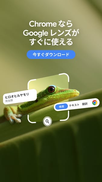
This ad promotes the Google Lens feature within the Chrome browser, highlighting its ability to identify and provide information about objects in the real world. The ad features an image of a lizard being scanned by Google Lens, showcasing the feature's ability to identify the species.
# Brand positioning
This ad promotes Google Chrome and Google Lens as tools that provide immediate access to information about the world around you. The brand is positioned as innovative and user-friendly, emphasizing the ease with which users can access Google Lens within the Chrome browser. The brand aims to occupy a space in the consumer's mind as a go-to for instant information and seamless integration of useful tools.
# Product
The ad features Google Lens, a visual search tool integrated within the Chrome browser. Google Lens allows users to identify objects in the real world by scanning them with their phone's camera. The ad highlights the feature's ability to identify a lizard species, providing information about it. The ad addresses the barrier of needing to manually search for information by offering a quick and easy way to identify and learn about objects through visual scanning.
# Visual style
The ad has a clean and modern visual style. The image is well-lit and the colors are vibrant. The use of white space and simple shapes creates a sense of clarity and ease of use. The overall aesthetic is consistent with the Google brand.
# Hooks
Headline: Chromeなら Google レンズが すぐに使える
# Funnel stage
Middle of funnel (Consideration)
# Pain points
The ad addresses the pain point of needing to manually search for information by offering a quick and easy way to identify and learn about objects through visual scanning.
# Value propositions
- Google Lens is readily available within the Chrome browser
# Benefits
- すぐに使える
# Features
- Google レンズ
# Call to action
今すぐダウンロード
# Social proof
- None used.
# Point of view
- Brand: The brand is communicating the availability and ease of use of Google Lens within the Chrome browser (top caption and download button).
# Storyline
- The ad opens by stating that Google Lens is readily available within the Chrome browser, immediately highlighting the product's accessibility. The brand is telling the audience that the feature is easy to use.
- The ad then shows Google Lens in action, scanning a lizard and providing information about its species. The brand is demonstrating the product's functionality and its ability to identify objects in the real world.
- The ad concludes with a call to action to download Chrome, encouraging viewers to try the feature for themselves. The brand is prompting the audience to take the next step and experience the product firsthand.
# Ad summary
This ad promotes the Google Chrome mobile app. It highlights the app's ability to quickly purchase items seen on screen using Google Lens.
# Brand positioning
Google Chrome is presented as a convenient and essential tool for smartphone users. The ad emphasizes Chrome's integration with Google Lens, positioning it as a seamless way to quickly purchase items seen on screen. The brand aims to occupy the space of a user-friendly and efficient mobile browser that simplifies online shopping. The brand aligns with values of convenience and technological innovation, pushing against the norm of traditional, less integrated mobile browsing experiences. The brand positioning is functional, focusing on simplicity and performance.
# Product
The Google Chrome mobile app is a web browser for smartphones that allows users to quickly purchase items they see on screen using Google Lens. The ad highlights the app's integration with Google Lens, enabling users to identify and buy products directly from images. The app is for smartphone users who want a seamless and efficient online shopping experience. The ad addresses the purchase barrier of time-consuming product searches by offering a quick and direct way to buy items seen on screen. The ad emphasizes the convenience and efficiency of using Chrome with Google Lens for mobile shopping.
# Visual style
The ad has a clean and minimalist aesthetic with a focus on functionality. The editing style uses quick cuts to transition between different product images and features. The production quality is polished, giving it a commercial feel. The pacing is fast, with cuts timed to the music beats.
# Hooks
Text overlay: Chrome の Google レンズで
Visual: 00:00–00:03: A light blue background features a white square containing an image of a pink velvet chair with black legs on a wooden floor. The Google Chrome app icon is positioned in the upper left corner of the white square. Below the chair image is a magnifying glass icon, indicating the Google Lens feature. The text "Chrome の Google レンズで" (Chrome's Google Lens) is displayed above the white square in black.
# Funnel stage
Middle of funnel (Consideration)
# Pain points
The ad addresses the frustration of time-consuming product searches. "画面上の商品をクイック購入" (Quick purchase of products on the screen) implies that users often struggle with finding and buying items they see online.
# Value propositions
- Quick purchase of products on the screen: This combines the feature of Google Lens integration with the benefit of fast and easy shopping.
- Convenient Chrome that can be used on smartphones: This highlights the accessibility and ease of use of the Chrome app on mobile devices.
# Benefits
- Quick purchase of products on the screen
- Convenient Chrome that can be used on smartphones
# Features
- Google Lens integration
- Quick purchase functionality
# Call to action
今すぐダウンロード (Download now)
# Social proof
- None used.
# Point of view
- Brand 100% – The ad is presented from the official voice of the brand, showcasing product features and benefits.
# Storyline
- 00:00–00:00 The ad opens with the Google Chrome logo.
- 00:00–00:03 00:00–00:03: The ad shows the Google Chrome logo next to an image of a pink chair. The Google Lens icon appears below the chair, suggesting the app can identify the product. The text "Chrome の Google レンズで" (Chrome's Google Lens) appears above the images, introducing the feature.
- 00:03–00:06 00:03–00:06: The screen displays multiple images of the pink chair with product details and pricing, indicating that Google Lens has identified the item and is ready for purchase. The text "画面上の商品をクイック購入" (Quick purchase of products on the screen) appears above the images, highlighting the benefit of the feature.
- 00:06–00:09 00:06–00:09: The ad shows the Google Chrome logo above the text "スマホでも使える便利な Chrome" (Convenient Chrome that can be used on smartphones). A button below the text reads "今すぐダウンロード" (Download now), prompting the viewer to download the app.
# Ad summary
This ad promotes the Google Chrome mobile app, highlighting its security features and ease of use on smartphones. The ad uses a clean, minimalist design with animated graphics to showcase how Chrome can detect and block dangerous websites, ensuring a safer browsing experience. It concludes with a call to action to download the app.
# Brand positioning
Google Chrome is presented as a reliable and secure web browser that prioritizes user safety and convenience. The brand is positioned as a protector against online threats, offering advanced features to detect and block dangerous websites. It emphasizes simplicity and ease of use, making it accessible for all smartphone users. The brand aligns with values of security, efficiency, and user empowerment, pushing against the norm of unprotected browsing experiences. The positioning is both functional (security, simplicity) and emotional (peace of mind).
# Product
The Google Chrome mobile app is a web browser designed for smartphones, offering advanced security features to protect users from dangerous websites. It works by detecting and blocking risky sites, ensuring a safer browsing experience. The app is for anyone who uses a smartphone to browse the internet and wants to avoid online threats. Key features include real-time threat detection, automatic security updates, and a user-friendly interface. The ad highlights the app's ability to "detect dangerous sites" and "shut out risks," emphasizing its unique selling points. It is shown being used on a smartphone, indicating its primary use occasion. The ad addresses the purchase barrier of online security concerns by showcasing how Chrome provides a secure browsing environment, making it worth trying for users seeking peace of mind.
# Visual style
The ad has a clean and minimalist aesthetic with a polished commercial feel. It uses static shots and smooth transitions to convey a sense of reliability and professionalism. The color palette is simple, with white, blue, and the primary colors of the Chrome logo dominating the visuals. The pacing is consistent, with cuts timed to the music beats, creating a rhythmic and engaging experience.
# Hooks
Spoken: 00:00–00:03: [Singing] Doo doo doo doo, doo doo doo doo, doo doo doo
Text overlay: 00:01–00:04: 危険なサイトを検出するChromeの優れた機能で
Visual: 00:00–00:01: A white screen displays the Google Chrome app icon, which is a rounded square with the Chrome logo (a red, yellow, green, and blue circular design). The camera is static, and the lighting is bright and even. / 00:01–00:04: A white smartphone graphic is centered on a light blue rectangular background. The phone screen displays a simplified banking app interface with a blue icon resembling a bank building. Text in Japanese is above the phone, and smaller text is below the screen. The Chrome app icon is positioned above the phone. The phone screen changes to display a red warning triangle with an exclamation point, indicating a security alert. The camera is static, and the lighting is bright and even.
# Funnel stage
Top of funnel (Awareness)
# Pain points
The central frustration is the risk of encountering dangerous websites while browsing on a smartphone. The ad visually demonstrates this with a red warning triangle appearing on a banking app interface, signaling a security threat.
# Value propositions
- Advanced security features to protect users from dangerous websites
- Real-time threat detection for a safer browsing experience
- User-friendly interface for easy use on smartphones
# Benefits
- Protection from online threats
- Safer browsing experience
- Easy to use on smartphones
# Features
- Detect dangerous sites
- Shut out risks
- Convenient Chrome for smartphones
# Call to action
今すぐダウンロード (Download now)
# Social proof
- None used.
# Point of view
- Brand 100% – The entire ad is presented from the official voice of the Google Chrome brand, showcasing its features and benefits.
# Storyline
- 00:00–00:01 The ad begins with the Google Chrome logo, immediately establishing brand recognition.
- 00:01–00:04 00:01–00:04: The ad shows a smartphone screen with a banking app interface. A red warning symbol appears, indicating a dangerous site has been detected. This conveys a sense of urgency and highlights the potential risks of unprotected browsing. The perspective is from the brand, showcasing its security features.
- 00:04–00:06 00:04–00:06: The warning symbol is replaced by a blue shield with a checkmark, symbolizing protection and security. This is a direct response to the previous moment, showing how Chrome effectively blocks threats. The perspective remains from the brand, emphasizing its protective capabilities.
- 00:06–00:09 00:06–00:09: The ad concludes by reiterating that Chrome is a convenient browser for smartphones and includes a call to action to download the app. This reinforces the product's accessibility and encourages immediate action. The perspective is from the brand, promoting its mobile app.
# Ad summary
This ad promotes the Gemini AI assistant in the Chrome browser. It shows how Gemini can help users understand coding concepts by providing explanations in different ways.
# Brand positioning
The ad presents Google Chrome as a platform that integrates AI to enhance user experience. The brand is positioned as innovative and helpful, aiming to simplify complex tasks like coding through AI assistance. The tone is functional, focusing on the practical benefits of using Gemini within Chrome to solve coding-related problems.
# Product
The ad features Gemini, an AI assistant integrated into the Chrome browser. Gemini helps users understand coding concepts by providing explanations in different ways. The product is for anyone who finds coding difficult to understand. The ad shows Gemini being used to explain complex coding concepts in a simpler, more understandable way. The key selling point is Gemini's ability to simplify complex topics, making it easier for users to learn and understand coding.
# Visual style
The ad has a clean and modern aesthetic with a focus on functionality. The editing style is simple with static shots and smooth transitions. The production quality is polished, giving it a commercial feel. The pacing is consistent, with a moderate tempo. The visuals are synced with the music beats.
# Hooks
Spoken: 00:07–00:08: [deep] Switch
Text overlay: 00:07–00:08: Gemini
Visual: 00:07–00:08: A close-up of the Chrome browser toolbar. A cursor clicks on the Gemini icon (a blue and purple star). The camera zooms in slightly.
# Funnel stage
Middle of funnel (Consideration)
# Pain points
The ad addresses the frustration of not understanding complex coding concepts.
# Value propositions
- Simplifies complex topics
- Makes it easier to learn and understand coding
# Benefits
- Helps users understand coding concepts
- Provides explanations in different ways
# Features
- AI assistant integrated into Chrome browser
# Call to action
None used.
# Social proof
- None used.
# Point of view
- Brand 100% – The ad is presented from the official voice of the brand, showcasing the product's features and benefits.
# Storyline
- 00:00–00:02 The ad opens with the Chrome and Gemini logos appearing on a white background.
- 00:02–00:04 The text "Say hello to Gemini in Chrome" appears on the screen, introducing the product.
- 00:04–00:06 A Chrome browser window is shown with the headline "Coding Made Easy" and an image of code on a laptop screen.
- 00:06–00:07 The cursor clicks on the Gemini icon in the browser toolbar, opening the Gemini chat window.
- 00:07–00:09 A user types "I don't get this. Can you explain it in a different way?" into the Gemini chat window.
- 00:09–00:10 Gemini responds with "Just a sec..." indicating it is processing the request.
- 00:10–00:12 Gemini provides a detailed explanation of the coding concept, using an analogy of an "adding machine."
- 00:12–00:14 The ad ends with a close-up shot of hands typing code on a laptop, reinforcing the coding theme.
# Ad summary
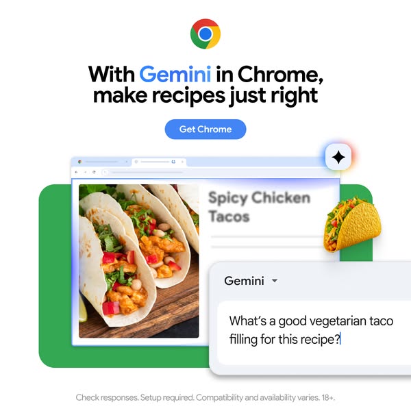
This ad promotes the Gemini AI assistant within the Chrome browser, highlighting its ability to assist with recipe planning. The ad features an image of a Chrome browser displaying a recipe for spicy chicken tacos, alongside a Gemini chat interface suggesting vegetarian taco fillings.
# Brand positioning
The brand being promoted is Google Chrome with its Gemini AI assistant. The brand is positioned as an innovative and helpful tool that enhances the user's browsing experience, specifically in the context of recipe planning. The brand aims to occupy the space of a smart, integrated assistant that simplifies everyday tasks. The brand aligns with values of convenience, efficiency, and technological advancement. It pushes against the norm of traditional search engines by offering AI-powered suggestions and solutions directly within the browser.
# Product
The product being advertised is the Gemini AI assistant integrated within the Google Chrome browser. Gemini is presented as a tool that helps users with recipe planning by providing suggestions and answering questions directly within the browser interface. The ad highlights Gemini's ability to suggest vegetarian taco fillings when prompted, showcasing its versatility and usefulness for various dietary preferences. The product is for anyone who uses the Chrome browser and needs assistance with recipe ideas or cooking-related questions. The ad addresses the purchase barrier of uncertainty or lack of inspiration when it comes to meal planning, positioning Gemini as a solution to easily generate ideas and customize recipes.
# Visual style
The ad has a clean and modern visual style with a focus on showcasing the product within a realistic use case. The production quality is high, with clear images and a well-organized layout. The visual motifs include a combination of real-life imagery (the tacos) and digital interface elements (the Chrome browser and Gemini chat box). The image treatment is bright and well-lit, with a focus on making the product and its features stand out. The typography is clean and legible, and the overall design is intended to be scannable and informative.
# Hooks
Headline: With Gemini in Chrome, make recipes just right
# Funnel stage
Middle of funnel (Consideration)
# Pain points
The ad addresses the pain point of needing inspiration or ideas for recipes, specifically vegetarian options. The question "What's a good vegetarian taco filling for this recipe?" signals the user's need for assistance in finding suitable ingredients.
# Value propositions
- Gemini in Chrome to make recipes just right
# Benefits
- make recipes just right
# Features
- Gemini in Chrome
# Call to action
Get Chrome
# Social proof
- None used.
# Point of view
- Brand: The headline and the visual of the Chrome logo at the top of the image establish the brand's presence and message.
- Customer: The chat interface with the question about vegetarian taco filling represents the customer's perspective and their interaction with the Gemini AI assistant.
# Storyline
- The ad opens by introducing Gemini in Chrome as a tool to "make recipes just right," immediately setting the stage for its purpose. The brand is telling the audience that Gemini can help them perfect their recipes.
- The ad then shows a Chrome browser displaying a recipe for "Spicy Chicken Tacos," providing a visual context for the product's use. The brand is showing a specific example of how Gemini can be used in a real-world scenario.
- A Gemini chat interface appears, with a user asking, "What's a good vegetarian taco filling for this recipe?" This highlights Gemini's ability to provide personalized suggestions. The customer is demonstrating a specific use case and asking a question that Gemini can answer.
# Ad summary
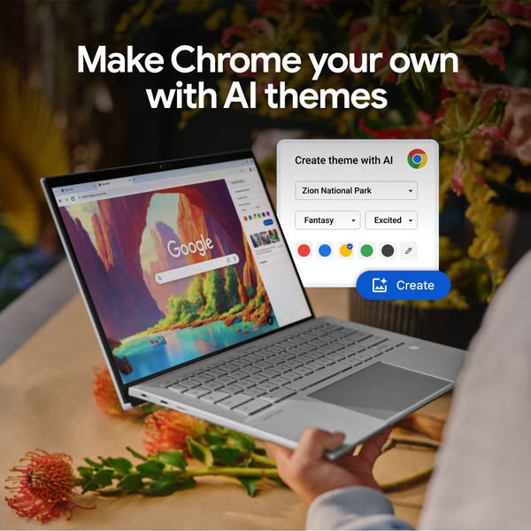
This ad showcases the AI theme creation feature in Chrome, allowing users to personalize their browsing experience. The ad features a laptop displaying the Chrome browser with a custom theme, alongside a floating window demonstrating the AI theme creation interface.
# Brand positioning
Google Chrome is presented as a customizable and innovative browser that leverages AI to enhance user experience. The brand aims to occupy the space of a user-friendly, personalized, and technologically advanced browsing platform. It aligns with values of creativity, individuality, and seamless integration of technology into daily life. The brand pushes against the norm of static, unchangeable browser interfaces by offering dynamic, AI-driven customization options. The brand positioning is both functional (offering AI-driven customization) and emotional (allowing users to express their individuality through personalized themes).
# Product
The featured product is the AI theme creation feature within the Google Chrome browser. This feature allows users to personalize their browsing experience by generating custom themes using artificial intelligence. The product is for anyone who wants to add a personal touch to their browser interface. Users can input specific parameters such as location (e.g., "Zion National Park") and mood (e.g., "Fantasy," "Excited") to generate unique themes. The USPs include AI-driven customization, ease of use, and the ability to create a personalized browsing environment. The ad demonstrates the use occasion of setting up a new browser theme. The purchase barrier addressed is the perceived complexity of customizing browser themes, which is simplified through AI.
# Visual style
The ad has a clean and modern visual aesthetic with a focus on showcasing the product in a natural setting. The production quality is high, with a well-lit and composed shot. The visual motif includes a combination of technology (laptop, browser interface) and nature (flowers, landscape theme). The image treatment includes background blurring to focus attention on the product. The typography is clean and legible, integrated seamlessly into the design. The style aims to be both informative and visually appealing, enhancing scannability and stop power in feed.
# Hooks
Headline: Make Chrome your own with AI themes
# Funnel stage
Middle of funnel (Consideration)
# Pain points
The ad addresses the pain point of a generic, unpersonalized browsing experience. The ad copy "Make Chrome your own with AI themes" directly implies that users may feel their current browser lacks individuality.
# Value propositions
- Make Chrome your own with AI themes: This combines the feature (AI themes) with the benefit (personalization).
# Benefits
- Personalized browsing experience
- Easy theme creation
- Unique browser interface
# Features
- AI theme creation
- Customizable themes
- Location-based themes
- Mood-based themes
# Call to action
Create
# Social proof
- None used.
# Point of view
- Brand: The entire ad is presented from the brand's perspective, showcasing the features and benefits of the AI theme creation tool in Google Chrome.
# Storyline
- The ad opens by highlighting the ability to personalize Chrome with AI themes, conveying the message that users can make the browser their own. This is told from the brand's perspective, setting the stage for showcasing the customization feature.
- The ad then shows a laptop screen displaying the Chrome browser with a custom theme, alongside a floating window demonstrating the AI theme creation interface. This is from the brand's perspective, showing how easy it is to create a theme.
- The ad concludes with a call to action to create a theme, encouraging users to engage with the feature. This is from the brand's perspective, driving user interaction and adoption of the AI theme creation feature.
# Ad summary
This ad promotes Google Chrome and its Google Lens feature, which allows users to search what they see, ask questions, and get answers with AI overviews. The ad shows a laptop screen with a website, and a Google Lens window pops up to demonstrate how it works.
# Brand positioning
Google Chrome is presented as a modern and innovative web browser that leverages Google AI to enhance the user experience. The brand aims to occupy the space of a smart, efficient, and user-friendly browser that simplifies information retrieval. It aligns with values of convenience, intelligence, and technological advancement. The brand pushes against traditional search methods by offering visual search and AI-driven summaries, positioning itself as a forward-thinking solution for information access. The brand positioning is both functional (providing efficient search and AI overviews) and emotional (offering a sense of ease and empowerment through technology).
# Product
The ad features Google Lens, a feature within the Google Chrome browser that allows users to search what they see, ask questions, and get answers with AI overviews. It works by enabling users to visually select an area on their screen, prompting Google Lens to identify the objects or content within that selection. Users can then ask questions about the selected content, and Google Lens provides AI-generated overviews with relevant information. The USP is the ability to visually search and receive AI-driven summaries directly within the browser. The ad addresses the purchase barrier of traditional text-based search by offering a more intuitive and visual approach to finding information. The product is worth trying because it simplifies the process of gathering information about visual content, making it easier and faster to learn about the world around you.
# Visual style
The ad has a clean and modern aesthetic with a focus on showcasing the product's functionality. The editing style includes quick cuts and smooth transitions to keep the pace engaging. The production quality is polished, giving it a commercial feel. The pacing is consistent, with cuts timed to the music beats. The audio-visual sync is well-coordinated, with text and product actions timed to the music and voiceover.
# Hooks
Spoken: 00:10–00:12 [Singing] You gonna fly baby, you gonna fly baby, gonna take a fly baby.
Text overlay: 00:01–00:10 Google Lens can help you / 00:02–00:10 search what you see, / 00:04–00:10 ask a question / 00:06–00:10 and get an answer / 00:08–00:10 with AI Overviews
Visual: 00:01–00:02: A laptop sits on a wooden desk in front of a window with natural light. The laptop screen displays a website with an image of a room with plants. A blue water bottle, glasses, a pen, and a notebook are also on the desk. / 00:02–00:04: A cursor moves on the laptop screen, selecting a plant in the image. A Google Lens window pops up with similar images. / 00:04–00:07: The Google Lens window displays a search bar with the question "how big does this get?" and generates an answer. / 00:07–00:10: The Google Lens window provides an AI overview with detailed information about the plant, highlighting key facts in yellow.
# Funnel stage
Middle of funnel (Consideration)
# Pain points
The ad addresses the frustration of traditional text-based search methods, which can be time-consuming and less intuitive for visual content. The ad implies that users may struggle to find information about objects or scenes they see in images or real life. "Search what you see" directly counters this pain point by offering a visual search solution.
# Value propositions
- Google Lens can help you: This highlights the value of the feature in assisting users with visual search and information retrieval.
- AI Overviews: This emphasizes the use of artificial intelligence to provide comprehensive and efficient answers.
# Benefits
- Search what you see
- Ask a question and get an answer
# Features
- Google Lens integration
- AI Overviews
# Call to action
Download now
# Social proof
- None used.
# Point of view
- Brand 100% – The entire ad is presented from the official voice of the brand, showcasing the product's features and benefits.
# Storyline
- 00:00–00:00 The ad opens with the Google Chrome logo, immediately establishing the brand.
- 00:01–00:02 00:01–00:02: The scene transitions to a laptop displaying a website with plants. The text overlay states, "Google Lens can help you," introducing the featured product and its potential benefit.
- 00:02–00:04 00:02–00:04: A cursor selects a plant on the screen, and a Google Lens window pops up with similar images. The text overlay says, "search what you see," explaining the core function of Google Lens.
- 00:04–00:07 00:04–00:07: The Google Lens window displays a search bar with the question "how big does this get?" and generates an answer. The text overlay states, "ask a question and get an answer," highlighting the interactive capabilities of the feature.
- 00:07–00:10 00:07–00:10: The Google Lens window provides an AI overview with detailed information about the plant. The text overlay says, "with AI Overviews," emphasizing the use of artificial intelligence to deliver comprehensive answers.
- 00:10–00:14 00:10–00:14: The ad concludes with a call to action, urging viewers to download Chrome and browse with Google AI. The Google Chrome logo reappears, reinforcing brand recognition.
# Ad summary
This ad demonstrates how Google Chrome's Autofill feature can save time when making online purchases. It shows a simplified checkout process where Chrome automatically fills in payment information, making the transaction quick and easy.
# Brand positioning
Google Chrome is presented as a time-saving tool for online shopping. The brand aims to occupy the space of convenience and efficiency in the consumer's mind, aligning with a lifestyle that values speed and ease of use. The ad promotes a functional benefit (Autofill) to simplify online transactions, pushing against the norm of manual data entry. The brand's positioning is functional, focusing on performance and simplicity.
# Product
The ad features Google Chrome's Autofill feature, which automatically fills in payment information during online checkout. This feature is for anyone who shops online and wants to save time and effort. The ad shows a simplified payment form being populated with a credit card number, name, expiration date, and CVV. The USP is the time-saving aspect of Autofill, addressing the purchase barrier of tedious data entry. The ad shows the moment of use during an online purchase, highlighting how Chrome makes the process faster and more convenient. The ad tells the viewer that Chrome is worth trying because it eliminates the need to manually enter payment details, making online shopping quicker and easier.
# Visual style
The ad has a clean, minimalist aesthetic with a bright color palette. The editing style uses quick cuts and simple transitions to maintain a fast pace. The production quality is polished, giving it a commercial feel. The visual motifs include the Chrome logo and consistent use of light green and white backgrounds. The pacing is consistent, with cuts timed to the audio.
# Hooks
Spoken: 00:02–00:03: Check out.
Text overlay: 00:02–00:03: Check out
Visual: 00:00–00:02: A green square background displays a white square containing a cartoon-style green tennis racket and a tennis ball. Below, the price is listed as $82 next to a shopping cart icon. At the bottom, the white Chrome logo is visible. / 00:02–00:03: The view zooms in slightly, and the text "Check out" appears above the product image.
# Funnel stage
Middle of funnel (Consideration)
# Pain points
The ad addresses the frustration of manually entering payment information during online checkout. This is signaled by the transition from a product listing to a payment form, which is then automatically filled in.
# Value propositions
- Choose Chrome to save time with Autofill
# Benefits
- Save time
- Simplified checkout process
# Features
- Autofill feature
- Automatic filling of payment information
# Call to action
Download now
# Social proof
- None used.
# Point of view
- Brand 100% – The entire ad is presented from the official voice of the brand, showcasing the product's features and benefits.
# Storyline
- 00:00–00:02 The ad opens with a tennis racket and ball displayed as an online product listing, priced at $82, with a Chrome logo at the bottom.
- 00:02–00:03 The product listing transitions to a checkout screen, with a voiceover saying, "Check out."
- 00:03–00:05 A shopping cart icon appears with the text "in no time," emphasizing the speed of the process.
- 00:05–00:08 A payment form appears, which is automatically filled with credit card details (card number, name, expiration date, and CVV).
- 00:08–00:09 A green checkmark appears, indicating the payment is complete.
- 00:09–00:14 The Chrome logo reappears with the text "Choose Chrome to save time with Autofill," followed by a "Download now" button.
# Ad summary
This ad promotes Google Chrome as a fast, safe, and reliable browser for computers. It uses simple animations and text overlays to highlight these key benefits and encourages users to download the browser.
# Brand positioning
Google Chrome is presented as a leading web browser that prioritizes speed, safety, and user experience. The brand aims to occupy the space of a reliable and efficient tool for accessing the internet. The ad aligns with a functional brand positioning, emphasizing performance and simplicity. It promotes the idea that Chrome can make your browsing experience better by being fast, safe, and easy to use.
# Product
The ad promotes Google Chrome, a web browser designed for computers. It emphasizes the browser's speed and safety features, highlighting that it can make your browsing experience faster and safer. The ad also positions Chrome as a reliable choice for computer users, encouraging them to choose Google Chrome for their computer. The ad addresses the potential purchase barriers of slow or unsafe browsing by showcasing Chrome as a solution.
# Visual style
The ad has a clean and simple aesthetic with a polished commercial feel. It uses static shots and smooth transitions. The pacing is consistent with simple animations and text overlays. The visuals are timed to match the voiceover lines.
# Hooks
Spoken: 00:00–00:02: Make your browser fast.
Text overlay: 00:00–00:02: Make your browser fast
Visual: 00:00–00:02: A square blue background with the text "Make your browser fast" in white. The Google Chrome logo is at the bottom. A clock hand graphic animates to underline the word "fast".
# Funnel stage
Top of funnel (Awareness)
# Pain points
The ad addresses the pain point of slow and unsafe browsing experiences.
# Value propositions
- Make your browser fast: Highlights the benefit of improved speed.
- Make your browser safe: Highlights the benefit of enhanced security.
# Benefits
- Improved browsing speed
- Enhanced security
# Features
- Fast browsing
- Safe browsing
# Call to action
Download now
# Social proof
- None used.
# Point of view
- Brand 100% – The ad is told from the official voice of the brand, delivering product claims and encouraging users to download the browser.
# Storyline
- 00:00–00:02 The ad opens with a text overlay on a blue background.
- 00:00–00:02 The text overlay animates to highlight the word "fast" with a clock hand graphic.
- 00:03–00:05 The screen transitions to a white background with a text overlay.
- 00:03–00:05 The text overlay animates to highlight the word "safe" with a padlock graphic.
- 00:06–00:09 The screen transitions to a blue background with a text overlay and a browser window graphic.
- 00:06–00:09 The text overlay highlights the word "Chrome".
- 00:10–00:14 The screen transitions to a light blue background with the Google Chrome logo and text overlay.
- 00:10–00:14 The text overlay encourages users to download Google Chrome.
# Ad summary
This ad promotes Google Lens in Chrome, highlighting its ability to shop for anything seen online. The ad uses a combination of screen recordings and real-life shots to demonstrate the feature's functionality and ease of use.
# Brand positioning
Google Chrome is presented as a tool that enhances online shopping through its Google Lens feature. The brand is positioned as innovative and user-friendly, aiming to simplify the shopping experience by allowing users to easily find and purchase items they see online. The brand aligns with a lifestyle of convenience and efficiency, pushing against the traditional, more cumbersome methods of online shopping. The brand positioning is functional, focusing on the performance and simplicity of its Google Lens feature within the Chrome browser.
# Product
The featured product is Google Lens within the Chrome browser, a tool that allows users to shop for anything they see online. It works by enabling users to select an area of an image on a webpage, which then prompts Google Lens to identify the objects within that selection and provide shopping results. The product is for anyone who shops online and wants a more efficient way to find and purchase items they see in images. The ad highlights the USP of being able to shop directly from images, addressing the purchase barrier of difficulty in finding specific items seen online. The ad conveys that this product is worth trying because it simplifies and speeds up the online shopping process.
# Visual style
The ad has a clean and modern aesthetic with a mix of screen recordings and real-life shots. The editing style is quick and efficient, with smooth transitions between scenes. The production quality is polished, giving it a commercial feel. The pacing is consistent, with cuts timed to the music beats.
# Hooks
Spoken: 00:01–00:07: Shop anything you see online with Google Lens in Chrome.
Text overlay: 00:01–00:06: Shop anything you see online 📸 / 00:03–00:07: with Google Lens in Chrome
Visual: 00:01–00:06: A screen recording is shown with a yellow background. A browser window displays a webpage with a record player. A cursor selects the record player using Google Lens. A smaller window pops up showing similar record players with a "Shop now" button. / 00:06–00:07: A close-up shot inside a circular frame shows a person placing a black vinyl record on a record player. The record player is on a wooden surface.
# Funnel stage
Middle of funnel (Consideration)
# Pain points
The ad addresses the frustration of not being able to easily find and purchase items seen in images online. The visual of the cursor selecting an item and instantly finding similar products implies a solution to the problem of cumbersome online searches.
# Value propositions
- Shop anything you see online with Google Lens in Chrome: This combines the feature (Google Lens in Chrome) with the benefit (shopping anything you see online), highlighting the ease and convenience of the product.
# Benefits
- Simplified online shopping
- Efficient way to find and purchase items seen online
- Direct shopping from images
# Features
- Google Lens integration within Chrome
- Ability to select and search for items within images on webpages
- Display of similar items available for purchase
# Call to action
Download now
# Social proof
- None used.
# Point of view
- Brand 100% – The entire ad is presented from the official voice of the brand, showcasing the product's features and benefits through screen recordings and product demonstrations.
# Storyline
- 00:00–00:01 The ad opens with the Google Chrome logo, immediately establishing the brand.
- 00:01–00:06 00:01–00:06: The ad transitions to a screen recording of a webpage featuring a record player. A cursor selects the record player using Google Lens, which then displays similar items available for purchase. This demonstrates the core functionality of the product.
- 00:06–00:07 00:06–00:07: The ad cuts to a close-up shot of someone placing a record on a record player, providing a real-life context for the product being searched for. This connects the digital search with a tangible, relatable activity.
- 00:07–00:09 00:07–00:09: The ad concludes with a call to action, displaying the Google Chrome logo and prompting viewers to download Chrome for their computer. This reinforces the brand and provides a clear next step for viewers interested in using the Google Lens feature.
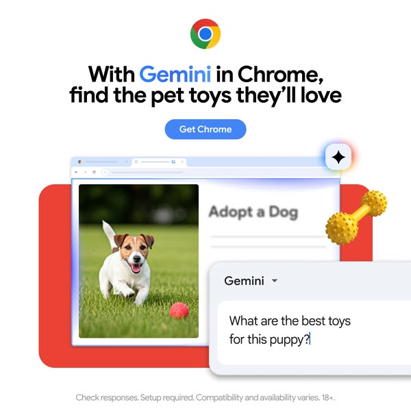
# Ad summary
This ad promotes the Gemini feature in Chrome, highlighting its ability to find pet toys. It showcases a dog running in a field, with a visual representation of a Chrome browser displaying an 'Adopt a Dog' page and a Gemini search query for the best puppy toys.
# Brand positioning
Google Chrome is presented as an innovative and helpful tool that enhances the user's browsing experience. The ad emphasizes Chrome's integration with Gemini to provide intelligent search capabilities, making it easier for users to find what they need. The brand aims to occupy a space in the consumer's mind as a user-friendly and efficient browser that simplifies everyday tasks. The brand aligns with values of convenience, intelligence, and personalization, positioning itself as a forward-thinking solution for modern internet users. This positioning is functional, focusing on the performance and simplicity of finding information.
# Product
The ad features the Gemini feature within the Google Chrome browser, designed to assist users in finding information more efficiently. It is shown in the context of searching for the best toys for a puppy, implying it is for pet owners or those interested in adopting a dog. The ad highlights the ability to ask questions directly within the browser and receive relevant results. The USP is the integration of AI-powered search capabilities directly into the browsing experience. The use occasion is when a user is looking for specific information online, such as pet supplies. The ad addresses the purchase barrier of time and effort required to find the right products by offering a quick and easy search solution.
# Visual style
The ad has a clean and modern visual style with a focus on showcasing the product in a clear and straightforward manner. The production quality is highly polished, with a studio-shot feel. The visual motifs include a grid layout and flat design elements. The image treatment includes background removal and subtle lighting effects. The typography is large and bold, making it easy to read. The style contrasts with platform-native content, aiming for a high-design look to capture attention in the feed.
# Hooks
Headline: With Gemini in Chrome, find the pet toys they'll love
# Funnel stage
Middle of funnel (Consideration)
# Pain points
The ad implies the pain point of difficulty in finding the right pet toys. The question 'What are the best toys for this puppy?' signals the frustration of not knowing where to start when searching for pet products.
# Value propositions
- Find the pet toys they'll love with Gemini in Chrome
# Benefits
- find the pet toys they'll love
# Features
- Gemini in Chrome
# Call to action
Get Chrome
# Point of view
- Brand: The entire ad is presented from the brand's perspective, showcasing the features and benefits of using Gemini in Chrome.
# Storyline
- The ad opens by introducing the Gemini feature in Chrome, immediately setting the stage for what the ad is about. The brand is telling the audience that Chrome now has an integrated feature to help users find what they need.
- The ad then shows a visual of a Chrome browser with an 'Adopt a Dog' page, alongside a Gemini search query for the best puppy toys. This is the brand showing a specific use case for the feature, demonstrating its utility in a relatable scenario.
- The ad concludes by showing a visual of a dog running in a field, reinforcing the pet-related theme and creating an emotional connection with the audience. The brand is reinforcing the use case and creating a positive association with the product.

# Ad summary
This ad promotes Google Chrome as a browser. It features a person using a laptop in bed with the Chrome browser open, encouraging viewers to download it.
# Brand positioning
Google Chrome is presented as a user-friendly and essential browser for everyday use. The brand aims to occupy the space of a reliable and accessible internet tool, suitable for personal and leisure activities. The ad aligns with a lifestyle of comfort and convenience, suggesting that Chrome seamlessly integrates into relaxed, at-home routines. It ignores the norm of formal or professional settings, instead focusing on a casual, personal environment, positioning itself as a browser for everyone, regardless of their technical expertise or specific needs. The brand positioning is functional, emphasizing simplicity and ease of use.
# Product
The product being advertised is the Google Chrome browser, a software application that allows users to access and navigate the internet. The ad implies that Chrome is for anyone who uses a laptop for leisure activities, particularly in a relaxed, home setting. The ad highlights the browser's accessibility and ease of integration into everyday life. The laptop screen displays the Google search engine, suggesting that Chrome provides a gateway to all online content. The ad addresses the potential barrier of browser choice by presenting Chrome as a simple and appealing option for casual internet use.
# Visual style
The ad has a cozy and casual visual aesthetic, with a focus on creating a relatable and inviting atmosphere. The production quality appears to be high, with well-lit and clear imagery. The visual motif is a relaxed, at-home setting, suggesting comfort and ease of use. The image treatment includes warm lighting and soft focus, enhancing the inviting feel. The typography is large and bold, ensuring scannability. The style contrasts with typical formal or professional browser ads, aiming for a more personal and approachable feel, which may increase stop power in feed.
# Hooks
Headline: Make Chrome your browser
# Funnel stage
Middle of funnel (Consideration)
# Pain points
The ad addresses the potential pain point of browser selection by presenting Chrome as a simple and appealing option for casual internet use. The ad implies that users may be looking for a browser that is easy to use and integrates seamlessly into their everyday lives. "Make Chrome your browser"
# Value propositions
- Make Chrome your browser
# Benefits
- Make Chrome your browser
# Features
- Browser
# Call to action
Download now
# Social proof
- None used.
# Point of view
- Brand: The text "Make Chrome your browser" and the "Download now" button represent the brand's direct communication and call to action.
# Storyline
- The ad opens with a cozy, relaxed setting of someone using a laptop in bed, creating a relatable and inviting atmosphere. This is included to establish a comfortable and familiar context for the viewer, suggesting that Chrome is suitable for everyday, casual use. The audience experiences this from the perspective of a potential user, seeing themselves in a similar situation.
- The text "Make Chrome your browser" appears prominently, directly addressing the viewer and encouraging them to adopt Chrome as their primary browser. This is included to clearly state the ad's objective and prompt the viewer to consider switching to Chrome. The brand is telling the audience to make Chrome their default browser.
- A "Download now" button is displayed, providing a clear call to action and facilitating immediate adoption of the browser. This is included to remove any barriers to entry and encourage immediate action. The brand is telling the audience to download the browser.
# Ad summary
This ad promotes the Gemini shortcut in Chrome, highlighting its ability to quickly provide AI assistance for tasks like creating a marathon training plan. The ad uses a fast-paced editing style and clear text overlays to showcase the product's features and benefits.
# Brand positioning
Google Chrome is presented as an innovative and user-friendly browser that integrates advanced AI technology to enhance productivity and simplify everyday tasks. The brand aims to occupy a space in the consumer's mind as a forward-thinking and efficient tool that leverages AI to provide quick and helpful solutions. The brand aligns with values of convenience, efficiency, and technological advancement, pushing against the norm of traditional browsers by incorporating AI-driven assistance. The brand positioning is both functional, emphasizing performance and simplicity, and emotional, promoting a sense of empowerment and ease of use.
# Product
The Gemini shortcut in Chrome is an AI-powered tool designed to provide quick assistance with various tasks directly within the browser. It allows users to input prompts, such as "Help me plan for a marathon. I have 4 months to train," and receive detailed, AI-generated plans. The product is for anyone looking to streamline their planning and information-gathering processes with the help of AI. The key features include the ability to generate personalized plans and access AI assistance directly within Chrome. The ad addresses the purchase barrier of complexity by showcasing the product's ease of use and quick results. The ad tells the viewer that this product is worth trying because it simplifies complex tasks and provides instant, AI-driven solutions, making planning and information access more efficient.
# Visual style
The ad has a clean, modern aesthetic with a focus on simplicity and clarity. The editing style is fast-paced, with quick cuts and smooth transitions to maintain viewer engagement. The production quality is polished, resembling a commercial with a focus on showcasing the product's features and benefits. The pacing is consistent, with cuts timed to the music beats and voiceover lines.
# Hooks
Spoken: 00:00–00:06: Get quick help from Google AI with the Gemini shortcut in Chrome.
Text overlay: 00:00–00:03 Get quick help from Google AI / 00:02–00:06 with the Gemini shortcut in Chrome
Visual: 00:00–00:00: The shot features the Google Chrome logo, a circular icon with red, green, yellow, and blue segments, centered on a white background. / 00:00–00:03: The shot displays a stylized Chrome browser window on a blue background, with the Chrome logo in the upper left corner. The address bar shows "G @gemini". The background is a gradient of light pink and white. Text overlay reads "Get quick help from Google AI with the Gemini shortcut in Chrome."
# Funnel stage
Top of funnel (Awareness)
# Pain points
The ad implies that planning and information gathering can be time-consuming and complex. Visual: The ad shows a user typing a detailed prompt, suggesting the need for assistance in simplifying the planning process.
# Value propositions
- Get quick help from Google AI with the Gemini shortcut in Chrome
- Switch to Chrome for faster access to Gemini
# Benefits
- Streamlined planning
- Efficient information gathering
- Personalized plans
# Features
- AI-powered assistance
- Gemini shortcut in Chrome
- Quick help for various tasks
# Call to action
Download now
# Social proof
- None used.
# Point of view
- Brand 100% – The entire ad is presented from the official voice of the brand, showcasing product features and benefits.
# Storyline
- 00:00–00:00 The ad opens with the Chrome logo, immediately establishing the brand.
- 00:00–00:03 00:00–00:03: The ad introduces the Gemini shortcut in Chrome, highlighting its ability to provide quick help from Google AI. This is conveyed through text overlay and a visual of a Chrome browser window with the Gemini interface. The message is intended to grab the viewer's attention by showcasing the product's core benefit: instant AI assistance.
- 00:03–00:06 00:03–00:06: The ad demonstrates the Gemini shortcut in action, showing a user inputting a prompt for a marathon training plan and the AI generating a detailed response. This is conveyed through a screen recording of the Chrome browser. The message is intended to illustrate the product's functionality and ease of use.
- 00:06–00:08 00:06–00:08: The ad transitions to a visual of a woman running, reinforcing the marathon training plan example. This is conveyed through a circular frame with the woman running. The message is intended to connect the product's AI assistance to real-world applications and outcomes.
- 00:08–00:09 00:08–00:09: The ad concludes with a call to action, encouraging viewers to switch to Chrome for faster access to Gemini and download the browser. This is conveyed through text overlay and a download button. The message is intended to drive immediate action and adoption of the product.
# Ad summary
This ad promotes Google Chrome and its Google Lens feature. The ad opens with a shot of a unique building in the desert and asks if the viewer needs travel inspiration. It then shows how Google Lens in Chrome can be used to search what you see and discover stellar destinations.
# Brand positioning
Google Chrome is presented as the only browser with Google Lens. The brand aims to occupy the space of being innovative and user-friendly, aligning with a lifestyle of exploration and discovery. The brand pushes against the norm of traditional search methods by offering a visual search alternative. The brand positioning is functional, emphasizing the simplicity and performance of its Google Lens feature.
# Product
The ad features Google Chrome with Google Lens, a feature that allows users to search what they see. The product is for anyone seeking travel inspiration or looking to discover new destinations. The ad highlights the USP of being able to visually search for destinations using Google Lens within the Chrome browser. The use occasion shown is during a video call, where the user sees a poster and wants to find the location. The ad addresses the purchase barrier of not knowing where to find unique travel destinations by offering a simple visual search solution.
# Visual style
The ad has a polished, commercial aesthetic with quick cuts and smooth transitions. The production quality is high-end, supporting the intended tone of innovation and user-friendliness. The pacing is consistent throughout the ad, with cuts timed to the music beats.
# Hooks
Spoken: 00:00–00:02: Need travel inspiration?
Text overlay: 00:00–00:02: Need travel inspiration?
Visual: 00:00–00:02: Low-angle shot of a red, UFO-shaped building in the desert. The sky is blue with some clouds. The building has several round windows. A person with a backpack walks towards the building.
# Funnel stage
Top of funnel (Awareness)
# Pain points
The ad addresses the pain point of needing travel inspiration and not knowing where to find unique destinations. The ad opens with the question, "Need travel inspiration?"
# Value propositions
- Google Lens in Chrome allows you to visually search for destinations, making it easy to find unique travel spots.
# Benefits
- Discover a stellar destination
# Features
- Google Lens in Chrome
- Search what you see
# Call to action
Download now
# Social proof
- None used.
# Point of view
- Customer 50% – The ad shows a person using the product in a real-life scenario, giving the perspective of a user.
- Brand 50% – The ad uses text overlays and the Google Chrome logo to communicate the brand's message and call to action.
# Storyline
- 00:00–00:02 00:00–00:02: The ad opens with a shot of a red, UFO-shaped building in the desert and asks, "Need travel inspiration?" This is intended to grab the viewer's attention and introduce the topic of travel.
- 00:02–00:04 00:02–00:04: The ad transitions to a person on a video call, looking at a poster of the same UFO-shaped building. The text overlay says, "With Google Lens in Chrome you can search what you see." This shows how the product can be used in a real-life scenario.
- 00:04–00:07 00:04–00:07: The ad shows the Google Lens feature in action, scanning the poster and finding the location. The text overlay says, "to discover a stellar destination." This highlights the benefit of using the product.
- 00:07–00:11 00:07–00:11: The ad returns to the shot of the UFO-shaped building in the desert, with a person and a dog standing in front of it. The text overlay says, "Found on Chrome." This reinforces the brand and the product's ability to help users find unique destinations.
- 00:11–00:14 00:11–00:14: The ad shows the Google Chrome logo and the text, "Choose Chrome: the only browser with Google Lens. Download now." This is a call to action, encouraging viewers to download the browser.
# Ad summary
This ad promotes Chrome as a safe browser with built-in malware protection. The ad shows a computer screen with a Google search page, which then transitions to a warning screen indicating a deceptive site. The ad highlights Chrome's ability to provide fair warnings and protect users from malware.
# Brand positioning
Chrome is presented as a reliable and secure web browser that prioritizes user safety. The brand is positioned as a protector against online threats, specifically malware and deceptive sites. The ad emphasizes Chrome's functional benefits, such as built-in malware protection, rather than emotional appeals. Chrome aims to occupy the space of a trustworthy and secure browser in the consumer's mind, pushing against the norm of other browsers that may not offer the same level of built-in protection.
# Product
The featured product is the Chrome web browser, which is presented as a secure and reliable tool for navigating the internet. The ad highlights Chrome's built-in malware protection, which warns users about deceptive sites and helps them avoid online threats. The product is for anyone who uses the internet and wants to protect themselves from malware and online scams. The ad addresses the purchase barrier of online security concerns by showcasing Chrome's ability to provide fair warnings and protect users from harmful websites. The USP is the built-in malware protection, which sets Chrome apart from other browsers.
# Visual style
The ad has a clean and simple aesthetic with a polished commercial feel. The editing style consists of static shots with smooth transitions. The pacing is consistent throughout the ad. The visuals are timed to match the voiceover lines.
# Hooks
Spoken: 00:00–00:01 You avoid trouble.
Text overlay: 00:00–00:01 You / 00:00–00:01 avoid / 00:01–00:01 trouble
Visual: 00:00–00:01: A square blue background with rounded corners. In the center, the white text "You avoid trouble" is displayed. Below the text is the Chrome logo.
# Funnel stage
Top of funnel (Awareness)
# Pain points
The ad addresses the pain point of encountering deceptive sites and malware while browsing the internet. The visual of the red warning sign with the text "Deceptive site ahead" signals this frustration.
# Value propositions
- Chrome provides built-in malware protection, ensuring users avoid trouble and receive fair warnings about deceptive sites.
# Benefits
- Avoid trouble
- Fair warning
# Features
- Built-in malware protection
# Call to action
Download now (Button)
# Social proof
- None used.
# Point of view
- Brand 100% – The entire ad is presented from the official voice of the Chrome brand, highlighting its features and benefits.
# Storyline
- 00:00–00:01 The ad starts with the text "You avoid trouble" on a blue background with the Chrome logo.
- 00:02–00:04 A computer screen appears, showing a Google search page with a bank-related image.
- 00:04–00:08 The screen transitions to a red warning sign with the text "Deceptive site ahead" and a button labeled "Back to safety."
- 00:08–00:10 The ad then shows the text "with fair warning" on a blue background with a checkmark.
- 00:11–00:14 The ad concludes with the text "Choose Chrome for built-in malware protection" and a "Download now" button.
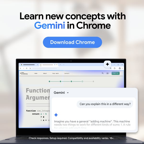
# Ad summary
This ad promotes Gemini in Chrome as a tool to learn new concepts. It shows a laptop screen with a coding website and a Gemini popup explaining a coding concept in a different way.
# Brand positioning
This ad positions Gemini as an educational tool that helps users learn new concepts, specifically in the realm of coding. It is presented as a feature within the Chrome browser, making it easily accessible for users already familiar with the platform. The brand aims to occupy a space in the consumer's mind as a helpful and innovative resource for understanding complex topics. The brand aligns with values of accessibility, education, and technological advancement. It pushes against the norm of traditional learning methods by offering a more interactive and readily available solution. The brand positioning is functional, focusing on the performance and simplicity of using Gemini to enhance learning within the Chrome environment.
# Product
The product being advertised is Gemini, an AI-powered tool integrated within the Chrome browser designed to help users learn new concepts. It works by providing explanations and alternative perspectives on complex topics, as demonstrated in the ad with a coding example. The product is for anyone looking to enhance their understanding of various subjects, particularly those involved in coding or technical fields. The ad highlights Gemini's ability to simplify complex information, making it easier to grasp. A key selling point is its integration within Chrome, offering seamless accessibility. The ad addresses the purchase barrier of complex learning by offering a simplified, AI-driven solution. The ad shows Gemini being used to explain a coding concept, suggesting its utility in educational settings or for professional development.
# Visual style
The ad has a clean and modern visual style with a focus on showcasing the product in a realistic use case. The production quality is high, with a well-lit and professionally composed shot. The visual motif is a focus on the laptop screen and the Gemini popup, highlighting the product's functionality. The image treatment includes background blurring and soft lighting to draw attention to the product. The typography is clean and legible, and the overall style is platform-native, fitting well within a typical in-feed ad.
# Hooks
Headline: Learn new concepts with Gemini in Chrome
# Funnel stage
Middle of funnel (Consideration)
# Pain points
The ad addresses the pain point of struggling to understand complex concepts, particularly in technical fields like coding. The ad shows Gemini providing an alternative explanation of a coding concept, suggesting its utility in simplifying difficult information.
# Value propositions
- Learn new concepts with Gemini in Chrome: This highlights the value of using Gemini to enhance learning within the Chrome environment.
# Benefits
- Helps users learn new concepts
- Simplifies complex information
- Offers seamless accessibility within Chrome
# Features
- AI-powered tool
- Integrated within the Chrome browser
- Provides explanations and alternative perspectives on complex topics
# Call to action
Download Chrome
# Social proof
- None used.
# Point of view
- Brand: The headline and CTA are from the brand's perspective, promoting the product and encouraging downloads.
- Customer: The laptop screen displaying a coding website with a Gemini popup providing an alternative explanation of a coding concept is from the customer's perspective, experiencing the product's functionality.
# Storyline
- The ad opens by stating that the viewer can "Learn new concepts with Gemini in Chrome", which is intended to grab the viewer's attention and introduce the product's core value proposition. This is told from the brand's perspective, highlighting the benefits of using Gemini for educational purposes.
- The ad then shows a laptop screen displaying a coding website with a Gemini popup providing an alternative explanation of a coding concept. This is intended to demonstrate how Gemini works in a real-world scenario, showcasing its ability to simplify complex information. This is shown from the customer's perspective, experiencing the product's functionality.
- The ad concludes with a "Download Chrome" CTA, which is intended to prompt the viewer to take immediate action and start using Gemini. This is told from the brand's perspective, driving conversions and user acquisition.
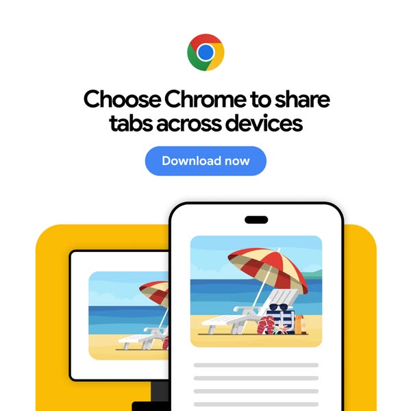
# Ad summary
This ad promotes the Chrome browser and its ability to share tabs across devices. The ad features a clean, minimalist design with a focus on functionality and ease of use.
# Brand positioning
Google Chrome is presented as a user-friendly and efficient browser that prioritizes seamless connectivity across multiple devices. The brand aims to occupy the space of a reliable and versatile tool for everyday internet use. The ad promotes a functional brand positioning, emphasizing simplicity and convenience for users who value efficiency and accessibility in their digital experience.
# Product
The ad promotes the Chrome browser, highlighting its ability to share tabs across devices. The product is for users who use multiple devices and want to easily access the same content on each. The ad addresses the potential frustration of having to search for the same information on different devices by offering a seamless solution. The ad emphasizes the convenience and efficiency of using Chrome to stay connected and productive across all devices.
# Visual style
The ad has a clean and minimalist visual style. The colors are bright and cheerful, and the overall design is simple and easy to understand. The use of flat design and vector graphics gives the ad a modern and approachable feel.
# Hooks
Headline: Choose Chrome to share tabs across devices
# Funnel stage
Middle of funnel (Consideration)
# Pain points
The ad addresses the frustration of needing to access the same tabs and information across multiple devices. The ad implies that it can be annoying to have to search for the same content on different devices.
# Value propositions
- Choose Chrome to share tabs across devices
# Benefits
- Seamless connectivity across multiple devices
# Features
- Share tabs across devices
# Call to action
Download now
# Social proof
- None used.
# Point of view
- Brand: The brand is communicating the benefits of using Chrome to share tabs across devices.
# Storyline
- The ad starts by highlighting the core problem: the need to share tabs across devices. The brand is telling the audience that they understand this common frustration and are about to offer a solution.
- The ad then showcases the Chrome browser on a desktop and a mobile device, both displaying the same content. The brand is showing the audience how Chrome solves the problem by seamlessly syncing tabs across devices.
- The ad ends with a clear call to action, inviting users to download Chrome now. The brand is prompting the audience to take immediate action and experience the benefits of Chrome for themselves.
How Other Technology Brands Advertise on Meta
Peer brands in Motion's library — click any brand to see their creative strategy, live ads, and AI breakdowns.