dbrand runs 169 active ads on Meta, shipping ~24 new creatives per week. Their library leans on Headline18%, Demo15%, and Pattern Interrupt13%. Recently, dbrand is pushing cases for the Galaxy S26 Ultra and a new cartoon-outline case collection across iPhone, Samsung, and Pixel devices. The messaging leans on standing out from generic designs, with pointed jabs at Samsung's Qi2 limitations and a recurring "your phone looks like everyone else's" angle.
# Ad summary
This ad showcases a silver Samsung smartphone with a black phone case. The phone is held up against the background of storage shelves.
# Brand positioning
Samsung is presented as a leading innovator in mobile technology, providing cutting-edge smartphones with advanced features and sleek design. The ad underscores Samsung's commitment to seamless integration with modern lifestyles, offering devices that cater to both aesthetic appeal and functional excellence. The brand occupies a premium space in the market, focusing on quality and user experience, and stands out by combining innovative technology with elegant design.
# Product
The product is a silver Samsung smartphone encased in a black phone case. The case features a prominent circular magnetic attachment for accessories. The phone has three visible camera lenses on the upper back, along with the flash. (on-package label text) includes the brand name 'samsung' printed at the bottom.
# Visual style
The ad uses a clean and direct visual style, focusing on product clarity and detail. The shot is well-lit and features a shallow depth of field to highlight the smartphone, while the background shelves add context without distraction. The overall aesthetic is modern and functional.
# Hooks
Headline: None used
# Funnel stage
Top of funnel (Awareness)
# Pain points
None used.
# Value propositions
- Modern design and practical utility.
# Benefits
- Sleek design
- Enhanced functionality
# Features
- Silver smartphone
- Black phone case
- Circular magnetic attachment
# Call to action
None used.
# Social proof
- None used.
# Point of view
- Brand: The focus on the Samsung phone's design and features shows the phone from the brand's point of view.
# Storyline
- The image focuses on a hand holding up a silver Samsung smartphone with a black magnetic case. The purpose of this shot is to draw the viewer's eye to the smartphone and its sleek design. The audience is experiencing it from a brand perspective.
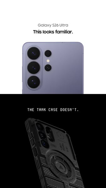
# Ad summary
This image ad compares the slim profile of the Galaxy S26 Ultra phone to the bulkier Tank Case.
# Brand positioning
The advertised brand is presented as a leader in mobile technology, specifically known for its Galaxy S26 Ultra phone. The brand positions itself on innovation and sleek design, contrasting with bulkier, more rugged alternatives. The visual comparison suggests that the brand prioritizes aesthetics and user-friendly design without compromising on advanced technology.
# Product
The ad showcases two products: the Galaxy S26 Ultra phone and the Tank Case. The Galaxy S26 Ultra is depicted as a slim, sleek smartphone, emphasizing its design and advanced camera technology. The Tank Case is presented as a rugged, protective phone case designed to provide maximum durability. The ad highlights the contrast between the phone's original design and the altered appearance with the Tank Case, emphasizing the Tank Case's robustness. It is implied that the Tank Case addresses concerns about device fragility and the need for robust protection in demanding environments.
# Visual style
The ad employs a split-screen visual to create a direct comparison. The top half features a clean, well-lit shot of the phone emphasizing its sleek design. The bottom half uses a darker, more dramatic lighting style to showcase the Tank Case's rugged features. The typography is modern and minimalist.
# Hooks
Headline: This looks familiar.
# Funnel stage
Middle of funnel (Consideration)
# Pain points
The ad addresses the potential pain point of phone fragility and the desire for robust protection.
# Call to action
None used.
# Social proof
- None used.
# Point of view
- Brand: The entire ad is from the brand's perspective, showcasing its product and comparing it to a third-party product.
# Storyline
- The ad opens with a sleek Galaxy S26 Ultra phone, immediately associating the brand with innovative design and advanced technology. This establishes a baseline expectation of elegance and sophistication.
- The ad presents the Tank Case, contrasting it with the sleek phone. This is intended to highlight the Tank Case's robust, rugged design.
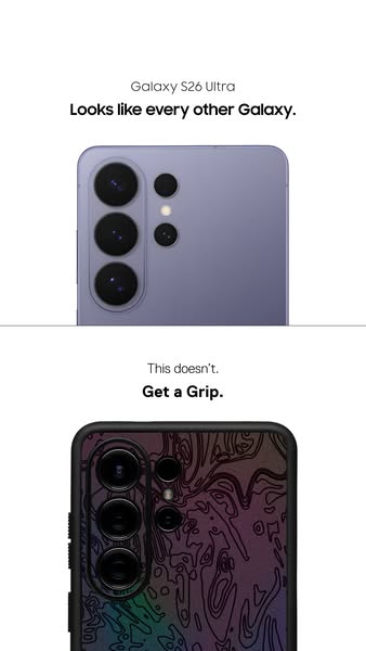
# Ad summary
This ad shows a Samsung Galaxy S26 Ultra in purple next to a Samsung Galaxy S26 Ultra in a black phone case with a topography design. The ad challenges the idea that phone cases are not unique and invites viewers to 'Get a Grip'.
# Brand positioning
The brand is presented as innovative and forward-thinking in the crowded smartphone market. The product challenges the notion that phones must all look the same, implying a brand ethos that values individuality. They push against the norm of generic phone design by offering customization options. The brand positioning is primarily functional, emphasizing the distinctiveness and personalization that its accessories can bring to an otherwise uniform product category.
# Product
The featured product is a protective phone case for the Samsung Galaxy S26 Ultra. The case has a black border with a topographic pattern in dark purple and rainbow colors on the back. The case is presented as a way to make a phone stand out from the crowd. The ad highlights the ability to personalize the appearance of the phone, counteracting the perception that all phones look the same. It directly addresses the purchase barrier of phones lacking individuality by offering a design that helps differentiate a user's phone.
# Visual style
The ad has a minimalist and modern aesthetic. The production quality is high, with clear product shots against a clean white background. There are two distinct product blocks separated with negative space to contrast the two phones.
# Hooks
Headline: Looks like every other Galaxy.
# Funnel stage
Middle of funnel (Consideration)
# Pain points
The central frustration the product is solving is the lack of distinctiveness in modern smartphones: “Looks like every other Galaxy.”
# Call to action
None used.
# Social proof
- None used.
# Point of view
- Brand: The brand is establishing a problem (phones look the same) and then suggesting its phone case as the solution.
# Storyline
- The ad opens with a top-down shot of a purple Samsung Galaxy S26 Ultra, which is meant to represent how the brand’s phones look the same as other phones. The message is meant to set the stage for the problem being addressed.
- The ad then shows a close-up of a Samsung Galaxy S26 Ultra phone in a black phone case with a topography design, indicating that this phone case makes the phone stand out. The message is meant to indicate the product as the solution to the problem in the ad.
Active·image · 1 variants
Us Vs Them
# Ad summary
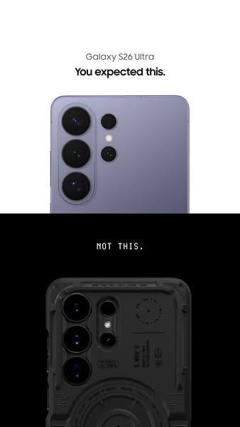
This ad shows an image of what the viewer might expect the next Samsung Galaxy phone to look like, but then the image shows a phone case instead.
# Brand positioning
The brand in this ad is associated with unique, modern design and high-quality materials. This positioning is implied by the product's sleek aesthetic, attention to detail, and use of premium materials. The brand is not afraid to challenge norms and offer a fresh perspective in the tech accessories market. This brand positions itself as an innovator that offers products with modern design elements.
# Product
The product is a phone case for the Samsung Galaxy S24 Ultra. It comes in black and has a transparent design. The case has cutouts for the camera lenses and other ports on the phone. The back of the case features design elements.
# Visual style
The ad has a clean and minimalist visual style with a duotone color scheme. The contrast between the sleek phone and the intricate case design is visually striking. The typography is simple and modern, complementing the overall aesthetic. The ad uses a before-and-after comparison to create intrigue.
# Hooks
Headline: You expected this.
# Funnel stage
Middle of funnel (Consideration)
# Pain points
Pain Point: Phone cases typically have a generic look. The ad addresses this by contrasting the phone case with a standard phone.
# Value propositions
- Provides a unique look and feel for the consumer's phone with a focus on the phone case.
# Benefits
- Implied: Provides a unique look for your phone.
# Features
- Phone case for the Samsung Galaxy S24 Ultra
# Call to action
None used.
# Social proof
- None used.
# Point of view
- Brand: The ad shows both the phone and the phone case.
# Storyline
- The ad starts with an image of what you would expect. This shows the new phone and sets the stage for the unexpected.
- The image switches to a phone case. This illustrates the twist in expectations and highlights the product being advertised.
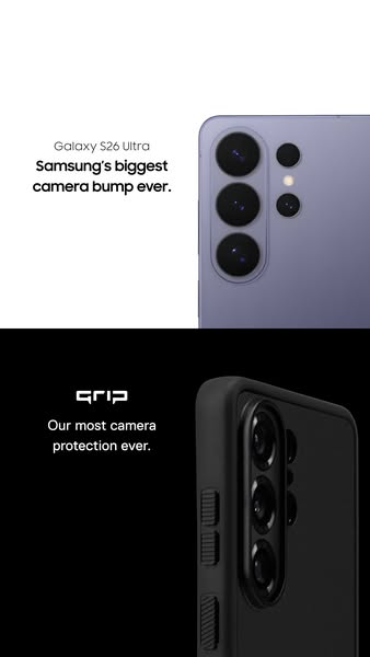
# Ad summary
This ad showcases a phone with a large camera and a phone case for it.
# Brand positioning
The brand is implied to be an innovative tech brand that creates phones with advanced camera technology. The brand challenges convention by embracing a large camera size as a feature rather than a flaw, pushing the boundaries of technology.
# Product
The ad features the brand's latest smartphone model, which boasts the "biggest camera bump ever" and the other product shown is a phone case specifically designed to protect it. The phone case is black and appears to be made of a shock-absorbent material, with the product name shown as 'Grip'. The phone case promises "our most camera protection ever," directly addressing concerns about the vulnerability of the phone's camera.
# Visual style
The ad has a sleek, minimalist aesthetic. The composition is divided into two distinct sections with stark contrast. High-quality product photography focuses on close-up shots of the phone and the case.
# Hooks
Headline: Samsung's biggest camera bump ever.
# Funnel stage
Middle of funnel (Consideration)
# Pain points
The phone's most prominent feature, the large camera bump, needs protection. This concern is visually emphasized by presenting the phone with the camera as the focal point, the phone's camera bump needs protection.
# Value propositions
- Protection of the biggest camera bump ever
# Benefits
- camera protection
# Features
- biggest camera bump ever
- most camera protection ever
# Call to action
None used.
# Social proof
- None used.
# Point of view
- Brand: top caption, presents the phone's camera as the key feature and unique selling point.
- Brand: bottom caption, introduces and highlights the phone case's protection capabilities, offering a solution to a potential concern about the phone's camera.
# Storyline
- The ad opens by presenting the phone's most prominent feature: the large camera. This is the brand introducing its latest innovation and emphasizing its commitment to pushing technological boundaries.
- The ad transitions to showcase the phone case as the product solving the main pain point, the phone's camera bump needs protection. This is the brand providing a practical solution to the challenge presented by its own product design.
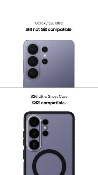
# Ad summary
This ad shows the difference between a Galaxy S26 Ultra phone without a case and a Galaxy S26 Ultra phone in the brand's S26 Ultra Ghost Case, highlighting the case's compatibility with Qi2 charging.
# Brand positioning
The ad showcases the brand's commitment to solving consumer pain points. In this case, the ad emphasizes the brand's awareness of consumer demand for compatibility with Qi2 charging, and their desire to meet that need by providing a compatible phone case. The brand positions itself as a provider of functional solutions by offering a Ghost Case that not only protects the phone but also enhances its charging capabilities.
# Product
The ad features two products. First, the Galaxy S26 Ultra phone, shown without a case, is promoted as not being Qi2 compatible. Second, the S26 Ultra Ghost Case, a phone case designed for the Galaxy S26 Ultra. The case is black and has a clear backing that exposes the purple color of the phone. The main unique selling proposition is that the S26 Ultra Ghost Case is Qi2 compatible, addressing the charging limitations of the phone itself.
# Visual style
The ad has a clean and minimalist visual style with a focus on product clarity. It uses a split-screen format to directly compare the phone without the case and the phone with the case. The lighting is soft and even, which accentuates the phone and case's design. The backdrop is pure white, which highlights the phone’s purple color.
# Hooks
Headline: Still not Qi2 compatible.
# Funnel stage
Middle of funnel (Consideration)
# Pain points
The pain point highlighted is the Galaxy S26 Ultra not being Qi2 compatible.
# Value propositions
- The S26 Ultra Ghost Case allows for Qi2 charging.
# Benefits
- Compatibility with Qi2 charging
# Features
- Qi2 compatible
# Call to action
None used.
# Social proof
- None used.
# Point of view
- Brand: The brand is emphasizing that the phone, without the case, is not Qi2 compatible, whereas the case resolves this issue.
# Storyline
- The ad starts by presenting the Galaxy S26 Ultra phone and stating that it's "Still not Qi2 compatible." This is to highlight a problem with the phone directly from the brand's perspective.
- The ad shows the phone with the S26 Ultra Ghost Case, declaring that it is "Qi2 compatible." This is from the brand's perspective and it introduces the product as a solution.
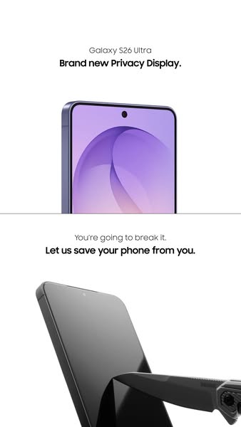
# Ad summary
The ad promotes the Galaxy S26 Ultra's brand new privacy display by emphasizing its durability with the tagline 'You're going to break it. Let us save your phone from you.'
# Brand positioning
The featured brand, Galaxy S26 Ultra, is presented as an innovator in mobile technology, specifically highlighting its advanced privacy display. The brand positions itself as a protector of its user's devices, emphasizing durability and reliability against damage. This positions the brand as one that understands the inevitability of accidents and offers solutions to mitigate them, making it both functionally and emotionally appealing by addressing the user's concern for their phone's safety.
# Product
The product being advertised is the Galaxy S26 Ultra with a 'Brand new Privacy Display.' The primary feature highlighted is the phone's ability to withstand damage, implying superior durability. The ad directly addresses the inevitability of accidents ('You're going to break it.') and positions the Privacy Display as a solution to protect the phone from everyday mishaps. This feature works by protecting the phone from the user's destructive tendencies, suggesting it is for individuals prone to accidents or rough handling of their devices.
# Visual style
The ad uses a clean, minimalist visual style with a white background to emphasize the product. The production quality appears highly polished, with studio-shot product photography that focuses on clarity and detail. The stark contrast between the pristine phone in the upper half and the threat of damage in the lower half creates visual tension. The typography is integrated cleanly, with a focus on legibility and direct messaging. This style contrasts with the typical chaotic social feed, potentially increasing stop power and scannability.
# Hooks
Headline: Brand new Privacy Display.
# Funnel stage
Middle of funnel (Consideration)
# Pain points
The central pain point is the inevitability of damaging or breaking one's phone screen, either by accident or through regular wear and tear. This is signaled by the phrase, 'You're going to break it.'
# Value propositions
- Brand new Privacy Display.
# Benefits
- Let us save your phone from you.
# Features
- Privacy Display
# Call to action
None used.
# Social proof
- None used.
# Point of view
- Brand: Top caption introduces the phone model and describes the new feature, 'Galaxy S26 Ultra Brand new Privacy Display.', as an opening statement to showcase the product and its innovation.
- Brand: The bottom caption uses a second person perspective, "You're going to break it. Let us save your phone from you.", as a way to directly address the viewer's potential problem with damaging their phone and offering a solution to protect their device.
# Storyline
- The ad starts by introducing the Galaxy S26 Ultra, showcasing its 'Brand new Privacy Display'. This is from the brand's perspective, setting the stage by presenting their latest innovation and immediately highlighting the product they want viewers to know about.
- The ad transitions to a cautionary message, 'You're going to break it,' followed by a protective offer: 'Let us save your phone from you.' This shifts the perspective to one that anticipates the customer's potential problem—accidental damage—and positions the brand as the solution provider, offering security and protection.
Active·image · 1 variants
Us Vs Them
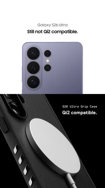
# Ad summary
This ad highlights the fact that the advertised phone case is compatible with Qi2 charging, unlike a competing model.
# Brand positioning
The brand is presented as innovative and forward-thinking. It recognizes the latest advancements in wireless charging technology and integrates them into its product line. The brand is also positioned as responsive to customer needs by addressing the compatibility issues of the competing product. The brand leans into a functional positioning, prioritizing seamless integration with modern technology to enhance the user experience.
# Product
The advertised product is the S26 Ultra Grip Case, designed for use with the S26 Ultra phone model. The case is Qi2 compatible, enabling wireless charging. Its design includes a textured, matte black exterior with multiple parallel ventilation slots. The case has a sleek, modern design that protects and enhances the phone's functionality. The ad addresses the purchase barrier related to the frustration of being incompatible with modern charging technology.
# Visual style
The ad employs a minimalist design with a focus on product features and compatibility. The use of contrasting colors (lavender-purple and matte black) separates the competing phone model from the product. The product is shown in sharp focus against a clean background. The overall style is modern and functional, with a clear emphasis on the charging feature.
# Hooks
Headline: Still not Qi2 compatible.
# Funnel stage
Middle of funnel (Consideration)
# Pain points
The ad is addressing the pain point of the competing phone model's incompatibility with the latest Qi2 wireless charging technology. The phrase 'Still not Qi2 compatible' is calling out a frustration many consumers feel when their devices cannot keep up with technological advancements.
# Value propositions
- Qi2 compatible
# Benefits
- Qi2 compatible
# Features
- Qi2 compatible
# Call to action
None used.
# Social proof
- None used.
# Point of view
- Brand, appearing throughout the ad, as the primary voice conveying the product’s features and contrasting it with the competitor’s limitations.
# Storyline
- The ad begins by showing the back of a Galaxy S26 Ultra phone and stating that it is 'Still not Qi2 compatible.' This is intended to highlight a key limitation of a competitor's device, positioning the brand as aware of this deficiency. The message is conveyed from the brand's perspective, focusing on a perceived weakness of a competing device and setting up the brand's product as a superior alternative.
- The ad transitions to a close-up of the S26 Ultra Grip Case attached to the phone and wirelessly charging, explicitly mentioning that it is 'Qi2 compatible.' This aims to showcase the product's unique selling proposition and address a pain point for users seeking modern charging capabilities. The brand is telling the story of how its product solves a problem that the competitor's product does not.
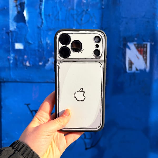
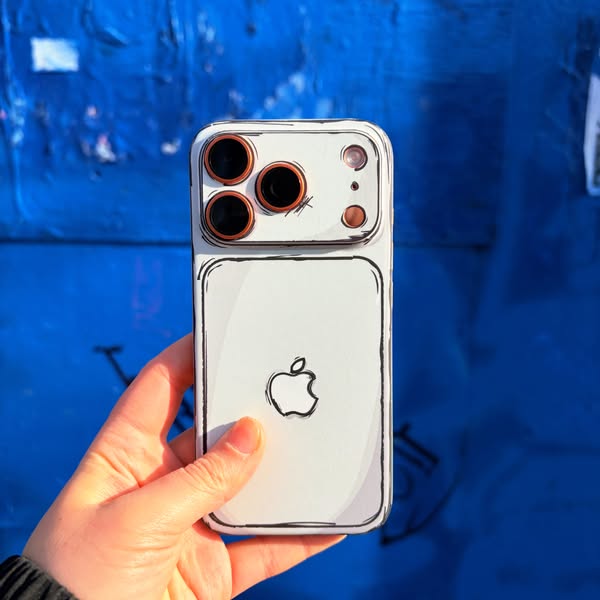
# Ad summary
This ad features a hand holding a phone with a cartoon-style phone case. The phone case is white with black line art, and the background is a blue wall.
# Brand positioning
This ad promotes a brand that specializes in unique and artistic phone cases. The brand aims to occupy a space in the consumer's mind as a provider of creative and visually distinctive phone accessories. The brand aligns with values of individuality, artistic expression, and a playful lifestyle. By offering phone cases with cartoon-style designs, the brand pushes against the norm of generic or minimalist phone accessories. The brand positioning is emotional, focusing on self-expression and standing out from the crowd.
# Product
The product featured is a phone case with a cartoon-style design. The case is white with black line art that mimics the appearance of a hand-drawn illustration. The design includes outlines of the phone's camera lenses and an Apple logo on the back. The case is designed for iPhone models, as indicated by the camera layout and Apple logo. The unique selling proposition (USP) is its distinctive cartoon-style aesthetic, which offers a playful and artistic alternative to conventional phone cases. The ad addresses the purchase barrier of wanting a phone case that stands out and reflects personal style.
# Visual style
The ad has a playful and artistic visual style, with a focus on the cartoon-style phone case. The production quality is high, with a clear and well-lit image. The visual motif is the cartoon-style line art, which is used to create a unique and eye-catching design. The image treatment includes background removal and color grading to enhance the blue tones of the wall. The typography integration is minimal, with no text overlays or captions. The style contrasts with typical phone case ads, which often feature minimalist designs or lifestyle shots.
# Hooks
Headline: None used
# Funnel stage
Top of funnel (Awareness)
# Pain points
The ad addresses the frustration of having a generic or uninspired phone case. The visual of the cartoon-style case implies a desire for a more unique and expressive accessory.
# Value propositions
- Cartoon-style design: Offers a playful and artistic alternative to conventional phone cases.
- Designed for iPhone: Ensures compatibility and a perfect fit for iPhone models.
# Benefits
- Unique and eye-catching design
- Playful and artistic aesthetic
- Transforms the phone's appearance
- Makes a statement
# Features
- Cartoon-style design
- Black line art
- White background
- Designed for iPhone
# Call to action
None used.
# Social proof
- None used.
# Point of view
- Customer: The hand holding the phone case gives the perspective of a customer interacting with the product in real life.
- Brand: The focus on the phone case design showcases the brand's unique aesthetic and product offering.
- External source: The blue wall background adds context to the product's presentation, suggesting an artistic and urban environment.
# Storyline
- The ad begins with a close-up shot of a hand holding a phone with a cartoon-style case. This is intended to immediately capture the viewer's attention with the unique design of the phone case. The audience experiences this from the perspective of someone encountering the product in real life, showcasing its visual appeal.
- The focus remains on the phone case, highlighting its cartoon-like features and how it transforms the phone's appearance. This is intended to emphasize the product's unique selling point and its ability to make a statement. The audience experiences this from the brand's perspective, showcasing the product's design and aesthetic.
- The background is a blue wall with graffiti, which adds to the overall artistic and urban vibe of the ad. This is intended to reinforce the brand's association with creativity and individuality. The audience experiences this from an external source, adding context to the product's presentation.
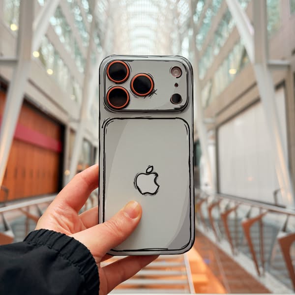
# Ad summary
This ad showcases a phone case with a cartoon outline design, emphasizing its unique aesthetic.
# Brand positioning
The brand is presented as innovative and design-focused, offering a unique aesthetic that stands out from typical phone case designs. The cartoon outline style suggests a playful and artistic approach, appealing to consumers who want to express their individuality through their accessories. The brand aims to occupy a space in the market that values creativity and distinctiveness, pushing against the norms of generic or purely functional phone cases. The brand positioning is emotional, focusing on self-expression and visual appeal.
# Product
The product is a phone case designed for an iPhone. It features a light gray base color with a black cartoon outline effect, giving the phone a hand-drawn appearance. The case covers the back and sides of the phone, with precise cutouts for the camera lenses and other features. The design includes a cartoon-style Apple logo on the back, maintaining the brand identity while adding to the overall aesthetic. The case is designed to protect the phone while also making it a unique accessory. The cartoon outline effect is the primary USP, offering a distinctive look that differentiates it from standard phone cases.
# Visual style
The ad has a clean and modern visual style with a focus on showcasing the product's unique design. The blurred background creates a sense of depth and draws attention to the phone case. The lighting is natural and even, highlighting the product's colors and details. The overall aesthetic is playful and artistic, reflecting the brand's focus on creativity and self-expression.
# Hooks
Headline: None used
# Funnel stage
Top of funnel (Awareness)
# Pain points
None used.
# Value propositions
- The cartoon outline design offers a distinctive look that differentiates it from standard phone cases.
- The precise cutouts ensure full functionality of the phone's features while maintaining protection.
# Benefits
- Unique aesthetic
- Protection for the phone
- Self-expression
# Features
- Cartoon outline design
- Precise cutouts for camera lenses
- Cartoon-style Apple logo
# Call to action
None used.
# Social proof
- None used.
# Point of view
- Brand: The entire image is presented from the brand's perspective, showcasing the phone case and its unique design features.
# Storyline
- The ad begins with a close-up shot of a hand holding the phone case, immediately drawing attention to the product's unique design. This is from the brand's perspective, showcasing the product's aesthetic appeal and inviting viewers to appreciate its artistic details.
- The camera angle focuses on the back of the phone, highlighting the cartoon outline effect and the Apple logo. This is from the brand's perspective, emphasizing the product's key features and design elements.
- The background is blurred, creating a sense of depth and drawing the viewer's eye to the phone case. This is from the brand's perspective, ensuring the product remains the focal point and stands out against its surroundings.
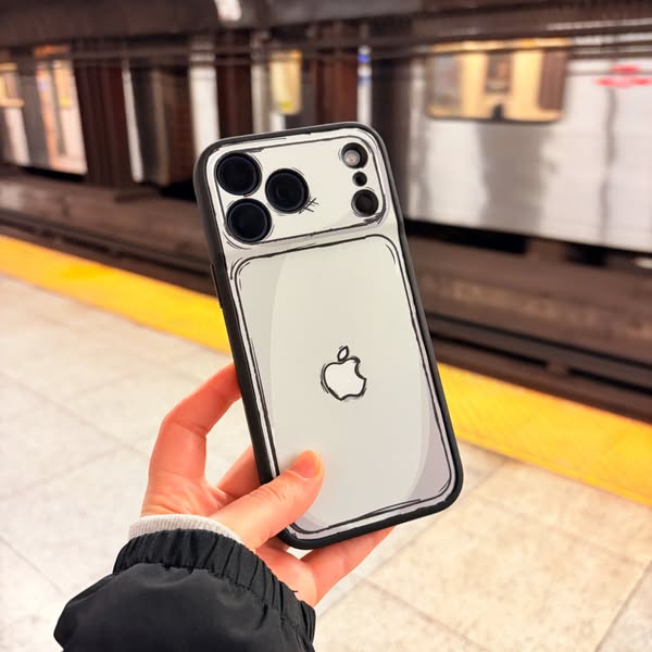
# Ad summary
This ad features a hand holding an iPhone with a phone case that has a cartoon-like design of an iPhone on it. The ad is set in a subway station.
# Brand positioning
This ad does not explicitly mention the brand of the phone case. However, the design of the phone case mimics the appearance of an iPhone, suggesting that the brand is focused on creating accessories that enhance or alter the look of existing devices. The brand seems to be targeting consumers who appreciate playful and creative designs that stand out from the norm.
# Product
The product featured is a phone case designed to look like a cartoon version of an iPhone. The case is black around the edges and has a white back with a cartoon drawing of an Apple logo. The design includes a cartoonish depiction of the iPhone's camera setup. The case is shown on an actual iPhone, indicating that it is a protective accessory that also serves as a decorative item. The ad highlights the unique design of the case, suggesting it is a way to personalize and add a playful touch to the user's phone.
# Visual style
The ad has a clean and modern visual style with a focus on showcasing the product in a real-world setting. The image is well-lit and has a slightly blurred background to keep the focus on the phone case. The cartoon-like design of the phone case adds a playful and unique element to the overall aesthetic.
# Hooks
Headline: None used
# Funnel stage
Top of funnel (Awareness)
# Pain points
None used.
# Value propositions
- Unique design that stands out
- Protective accessory with a decorative element
# Benefits
- Personalizes the phone
- Adds a playful touch
- Protects the phone
# Features
- Cartoon-like design of an iPhone
- Black edges and white back
- Cartoon drawing of an Apple logo
- Cartoonish depiction of the iPhone's camera setup
# Call to action
None used.
# Social proof
- None used.
# Point of view
- Customer: The image shows a hand holding the phone with the case, suggesting a user's perspective and showcasing how the product looks in use.
# Storyline
- The ad shows a hand holding an iPhone with a cartoon-style case in a subway station. This is from the perspective of someone who is observing the phone case in a real-world setting, showcasing its design and how it looks in everyday use. The intention is to capture attention with the unique design and provide a relatable context.
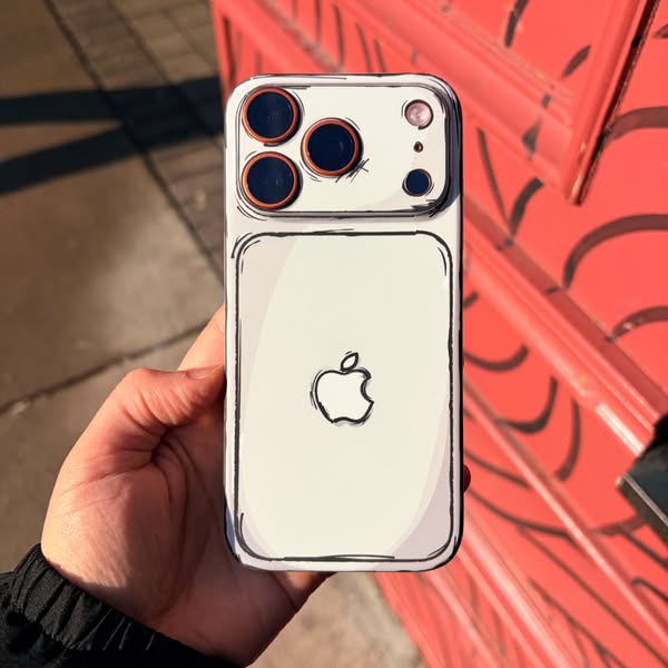
# Ad summary
This ad showcases a phone case that has a cartoon-like design. The ad features a hand holding the phone case, highlighting its unique aesthetic.
# Brand positioning
The brand is presented as offering unique and playful phone cases that allow customers to express their individuality. The cartoon-like design suggests a fun, creative, and youthful brand identity. The brand seems to push against the norm of sleek, minimalist phone accessories, instead opting for a more expressive and eye-catching style. The brand positioning is primarily emotional, focusing on self-expression and standing out from the crowd.
# Product
The product is a phone case designed to fit an iPhone. The case is white with a black outline, giving it a cartoon-like appearance. The design includes a drawn Apple logo on the back. The camera area on the back of the phone case is also outlined in black, with the camera lenses appearing as dark circles. The case is shown being held in a hand, indicating its use. The unique selling point is its distinctive cartoon aesthetic, which sets it apart from typical phone cases. The ad addresses the purchase barrier of wanting a phone case that is both protective and visually interesting.
# Visual style
The ad has a high production quality with a focus on showcasing the unique cartoon-like design of the phone case. The visual motif is the hand-drawn aesthetic, which is consistent throughout the image. The image treatment includes background blurring to emphasize the product. The typography integration is minimal, as the focus is on the visual design of the case. The style is disruptive, contrasting with typical sleek phone accessory ads, and aims to grab attention in the feed.
# Hooks
Headline: None used
# Funnel stage
Top of funnel (Awareness)
# Pain points
None used.
# Call to action
None used.
# Point of view
- Customer: The entire image is from the customer's point of view, showcasing the phone case as it would appear in hand.
# Storyline
- The ad begins with a close-up shot of a hand holding a phone with the cartoon-style case. This is intended to immediately capture attention with the unique design. The audience experiences this from the perspective of someone encountering the product for the first time, highlighting its visual appeal.
# Ad summary
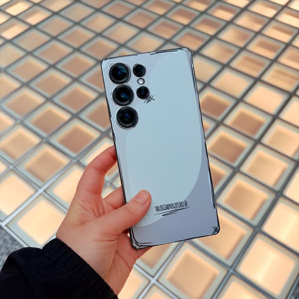
This ad features a Samsung phone with a cartoon filter applied to it. The phone is held in someone's hand and displayed over a background of square lights.
# Brand positioning
Samsung is presented as a technology innovator, specifically in the mobile phone market. The ad showcases the brand's ability to blend technology with artistic expression, suggesting that Samsung products are not only functional but also stylish and customizable. The brand aims to occupy a space in the consumer's mind as a provider of cutting-edge technology that allows for personal expression and creativity.
# Product
The product featured is a Samsung smartphone, showcasing its design and camera capabilities. The phone has a sleek, rectangular form factor with rounded edges and a matte finish. The rear of the phone features a multi-lens camera system, consisting of three large lenses and two smaller sensors. The phone is shown with a cartoon filter applied, giving it a hand-drawn appearance with thick black outlines. The Samsung logo is visible on the lower back of the phone. The ad highlights the phone's ability to transform everyday scenes into artistic creations through its camera and software capabilities.
# Visual style
The ad has a modern and playful visual style, blending technology with artistic expression. The production quality is high, with a clean and well-lit shot. The cartoon filter adds a unique touch, giving the phone a hand-drawn appearance. The image treatment includes background removal and color grading to enhance the overall aesthetic appeal. The typography integration is minimal, with the Samsung logo subtly placed on the back of the phone. The style is disruptive, contrasting the sleek design of the phone with the whimsical cartoon effect, making it stand out in the feed.
# Hooks
Headline: None used
# Funnel stage
Top of funnel (Awareness)
# Pain points
None used.
# Value propositions
- The multi-lens camera system and cartoon filter allow users to transform ordinary scenes into artistic creations.
# Benefits
- Transforms ordinary scenes into artistic creations
# Features
- Multi-lens camera system
- Cartoon filter
# Call to action
None used.
# Social proof
- None used.
# Point of view
- Customer: The hand holding the phone suggests a user's perspective, showing how the phone feels and looks in everyday use.
- Brand: The focus on the camera system and cartoon filter highlights the phone's unique features and capabilities.
- External source: The background of square lights adds depth and visual interest, creating a dynamic backdrop for the product.
# Storyline
- The ad opens with a hand holding a Samsung smartphone, presenting the product in a real-world context. This is intended to immediately engage the viewer by showcasing the phone's design and form factor from a user's perspective.
- The focus shifts to the phone's camera system and the cartoon filter applied to the image. This highlights the phone's unique features and capabilities, demonstrating how it can transform ordinary scenes into artistic creations from the brand's perspective.
- The background of square lights adds depth and visual interest, creating a dynamic backdrop for the product. This enhances the overall aesthetic appeal and reinforces the phone's ability to capture visually stunning images from an external source.
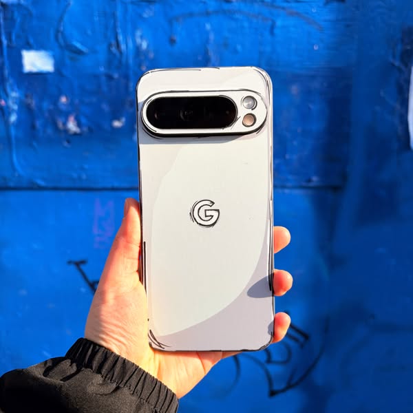
# Ad summary
This ad features a hand holding a Google Pixel phone with a cartoon-style filter applied. The background is a blue wall with graffiti.
# Brand positioning
The Google brand is presented as innovative and design-focused, with a playful edge. The cartoon filter applied to the phone suggests a brand that is not afraid to experiment with visual styles and appeal to a younger, more creative audience. The prominent display of the Google logo on the back of the phone reinforces brand recognition and positions Google as a leader in the tech industry.
# Product
The product featured is a Google Pixel phone, encased in a white phone case. The phone has a distinctive camera bar across the top, with two visible camera lenses and a flash. The phone case is white with a black outline, giving it a cartoon-like appearance. The Google logo is prominently displayed on the back of the phone case. The phone is held in a hand, showcasing its size and design. The cartoon filter applied to the phone and its case gives it a unique and playful look, highlighting the phone's design and the ability to customize it with accessories.
# Visual style
The ad has a playful and modern visual style, with a cartoon-style filter applied to the phone and its case. The background is a blue wall with graffiti, adding a touch of urban flair. The lighting is bright and even, highlighting the phone's design and the hand holding it.
# Hooks
Headline: None used
# Funnel stage
Top of funnel (Awareness)
# Pain points
None used.
# Value propositions
- The cartoon-style filter and phone case allow for a unique and personalized look.
# Benefits
- Unique design
- Customization
# Features
- Cartoon-style filter
- Phone case
# Call to action
None used.
# Social proof
- None used.
# Point of view
- Customer: The entire image is presented from the perspective of a potential customer viewing the phone and its unique design.
# Storyline
- The ad opens with a close-up shot of a hand holding a Google Pixel phone. This is intended to showcase the phone's design and the cartoon-style filter applied to it. The audience experiences this from the perspective of someone observing the phone.
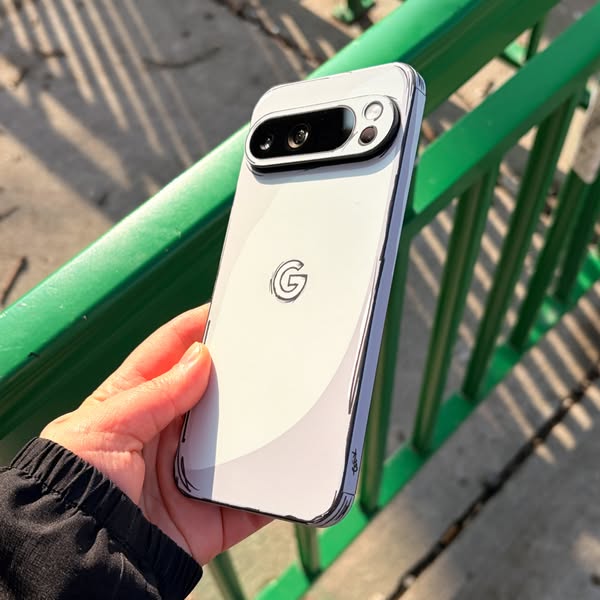
# Ad summary
This ad showcases a phone case with a cartoon outline design, emphasizing its unique aesthetic.
# Brand positioning
The brand is presented as modern and design-focused, appealing to consumers who value aesthetics and personalization in their tech accessories. The brand aims to occupy a space in the market that values unique and artistic expression, differentiating itself from brands that focus solely on functionality or protection. The brand aligns with a lifestyle that appreciates creativity and individuality, pushing against the norm of generic phone cases. The brand positioning is emotional, focusing on self-expression and visual appeal.
# Product
The product is a phone case designed for a Google Pixel phone. The case is white with a cartoon outline effect, giving it a unique, hand-drawn appearance. The case is shown on a Google Pixel phone, fitting snugly around the device and providing access to the camera and other features. The case's USP is its distinctive cartoon-style design, which adds a playful and artistic touch to the phone. The ad highlights the case's ability to transform the phone's appearance, making it a stylish accessory. The case is designed for individuals who want to personalize their phone and stand out from the crowd.
# Visual style
The ad has a clean and modern visual style, with a focus on showcasing the product in a realistic setting. The cartoon outline effect adds a playful and artistic touch, making the ad visually appealing and eye-catching. The production quality appears to be high, with attention to detail in the lighting and composition.
# Hooks
Headline: None used
# Funnel stage
Top of funnel (Awareness)
# Pain points
None used.
# Call to action
None used.
# Point of view
- Customer: The image shows the phone case from the perspective of someone holding the phone, allowing viewers to imagine themselves using the product.
# Storyline
- The ad presents a hand holding a Google Pixel phone with the cartoon outline case on it. This is intended to showcase the product in a real-world setting, allowing the audience to see how it looks and fits on the phone from the customer's perspective.
# Ad summary
This ad showcases a phone case with a cartoon outline design, emphasizing its unique aesthetic.
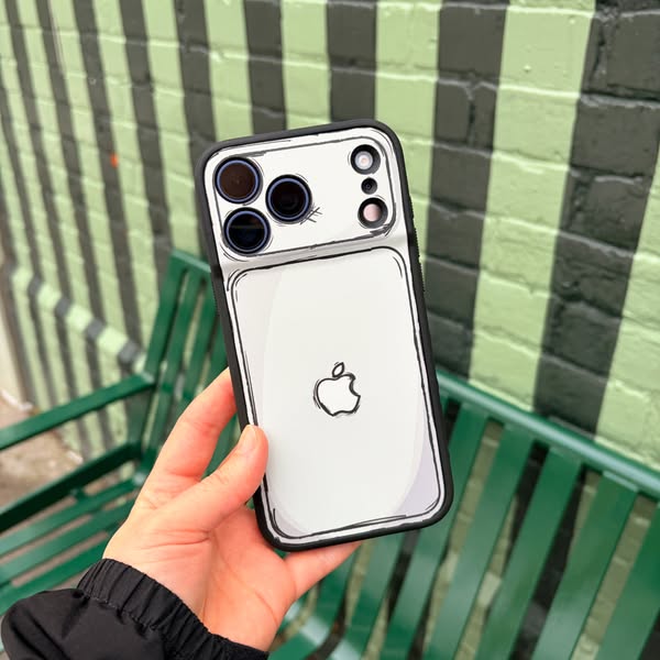
# Brand positioning
The brand is not explicitly mentioned, but the presence of the Apple logo on the phone case suggests that the brand aligns with modern technology and design. The cartoon outline style of the case implies a playful and creative brand identity, targeting consumers who want to express their individuality through their accessories. The brand seems to push against the norm of sleek, minimalist phone cases by offering a more whimsical and artistic option.
# Product
The product is a phone case designed for an iPhone. It features a clear or white backing with a black cartoon outline design that mimics the shape and features of the phone itself, including the camera module and Apple logo. The case has a black bumper around the edges for protection. The design gives the illusion that the phone is a hand-drawn sketch, adding a unique and artistic touch. The case is for iPhone users who want to personalize their device with a creative and eye-catching accessory.
# Visual style
The ad has a clean and modern visual style with a focus on showcasing the product's unique design. The production quality is high, with a well-lit and composed shot. The cartoon outline design of the phone case is the main visual motif, creating a playful and artistic aesthetic. The image treatment includes a slightly desaturated color palette, giving it a contemporary feel. The typography integration is minimal, with no text overlays or captions. The visual style is designed to be eye-catching and memorable, contrasting with typical phone case ads that focus on sleekness and minimalism.
# Hooks
Headline: None used
# Funnel stage
Top of funnel (Awareness)
# Pain points
The ad addresses the pain point of wanting to personalize your phone and stand out from the crowd. The cartoon outline design offers a unique and eye-catching way to express individuality.
# Value propositions
- Cartoon outline design for a unique and artistic look
- Black bumper provides protection while maintaining a stylish appearance
# Benefits
- Unique and artistic aesthetic
- Personalizes your device
- Eye-catching design
# Features
- Cartoon outline design
- Black bumper for protection
# Call to action
None used.
# Social proof
- None used.
# Point of view
- Customer: The hand holding the phone case provides a first-person view of how the product looks and feels in use.
- Brand: The focus on the case's design and features showcases the brand's unique aesthetic and product benefits.
- External source: The blurred urban background provides context and suggests the product's suitability for everyday use.
# Storyline
- The ad begins with a close-up shot of the phone case being held in someone's hand. This is intended to showcase the product's design and how it looks in real life, from the customer's perspective.
- The camera focuses on the cartoon outline design of the case, highlighting its unique and playful aesthetic. This is from the brand's perspective, emphasizing the product's key selling point.
- The background features a blurred urban setting, suggesting that the case is suitable for everyday use and fits into a modern lifestyle. This is from an external perspective, setting the scene and providing context for the product.
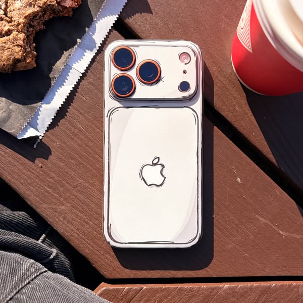
# Ad summary
This ad showcases a phone case with a cartoon outline design. The phone is placed on a wooden table next to a cookie and a cup of coffee.
# Brand positioning
The brand is not explicitly mentioned in the ad, but the presence of the Apple logo on the phone case implies that it is designed for Apple products. The cartoon outline design of the phone case suggests a playful and creative brand identity, appealing to consumers who want to personalize their devices with a unique and eye-catching accessory. The brand seems to be targeting a younger demographic that values aesthetics and self-expression.
# Product
The product being advertised is a phone case with a cartoon outline design. The case is white with black outlines that give the phone a hand-drawn appearance. The case is shown on an iPhone, with the Apple logo visible on the back. The design covers the entire back and sides of the phone, including the camera bump. The case appears to be made of a smooth, possibly plastic or silicone material. The unique selling point of the case is its distinctive cartoon-like aesthetic, which sets it apart from standard phone cases and offers a fun, personalized look.
# Visual style
The ad has a casual, lifestyle aesthetic with a focus on the unique cartoon outline design of the phone case. The image is well-lit with natural sunlight, creating a warm and inviting atmosphere. The composition is simple and uncluttered, drawing attention to the product and its surroundings. The overall style is clean and modern, with a touch of playfulness due to the cartoon design.
# Hooks
Headline: None used
# Funnel stage
Top of funnel (Awareness)
# Pain points
The ad addresses the desire for a unique and personalized phone case that stands out from the crowd. The cartoon outline design offers a creative alternative to standard phone cases.
# Value propositions
- The cartoon outline design offers a fun and creative way to personalize your iPhone.
- The phone case provides protection while adding a unique aesthetic to your device.
# Benefits
- Unique and eye-catching appearance
- Personalized device
- Protection for your phone
# Features
- Cartoon outline design
- Protective phone case
- Compatible with iPhone
# Call to action
None used.
# Social proof
- None used.
# Point of view
- Brand: The entire image showcases the phone case in a lifestyle setting, highlighting its design and how it integrates into everyday life.
# Storyline
- The ad presents a lifestyle scene with a phone case as the focal point. The phone is placed on a wooden table alongside a cookie and a cup of coffee, suggesting a casual, everyday setting. This is from the brand's perspective, showcasing how the product fits into the user's daily life.
# Ad summary
This ad features a hand holding a phone case with a cartoon-like design. The background is a blue wall with graffiti. The ad is designed to showcase the unique and eye-catching design of the phone case.
# Brand positioning
The brand is presented as offering unique and artistic phone cases that allow customers to express their individuality. The cartoon-like design of the phone case suggests a playful and creative brand identity. The brand aims to occupy a space in the consumer's mind as a provider of fun and expressive accessories that stand out from the norm. The brand aligns with values of creativity, self-expression, and individuality. It pushes against the norm of plain and generic phone cases, offering a more personalized and artistic option. The brand positioning is emotional, focusing on the fun and expressive aspects of the product.
# Product
The product is a phone case with a cartoon-like design. The case is white with black outlines, giving it a hand-drawn appearance. The design includes a cartoon version of the Apple logo on the back. The case is shown on an iPhone, fitting snugly around the phone. The case appears to be made of a hard, protective material. The unique selling point is its artistic and eye-catching design, which sets it apart from standard phone cases. The case is for anyone who wants to add a touch of personality and creativity to their phone. The ad addresses the purchase barrier of wanting a phone case that is both protective and stylish.
# Visual style
The ad has a clean and modern visual style, with a focus on showcasing the unique design of the phone case. The lighting is bright and even, highlighting the details of the product. The background is blurred, drawing attention to the phone case. The overall aesthetic is playful and artistic, reflecting the brand's identity.
# Hooks
Headline: None used
# Funnel stage
Top of funnel (Awareness)
# Pain points
The pain point is wanting a phone case that is both protective and stylish, rather than just functional or generic.
# Value propositions
- A phone case that is both stylish and protective
- A way to express your individuality through your phone case
# Benefits
- Unique and eye-catching design
- Adds personality to your phone
- Protects your phone from damage
# Features
- Cartoon-like design
- Protective material
- Snug fit
# Call to action
None used.
# Social proof
- None used.
# Point of view
- Brand: The entire image showcases the phone case from the brand's perspective, highlighting its unique design and visual appeal.
# Storyline
- The ad begins with a close-up shot of a hand holding a phone case with a cartoon-like design. This is intended to immediately capture the viewer's attention with the unique and eye-catching design of the product. The audience is experiencing it from the brand's perspective, showcasing the product's visual appeal.
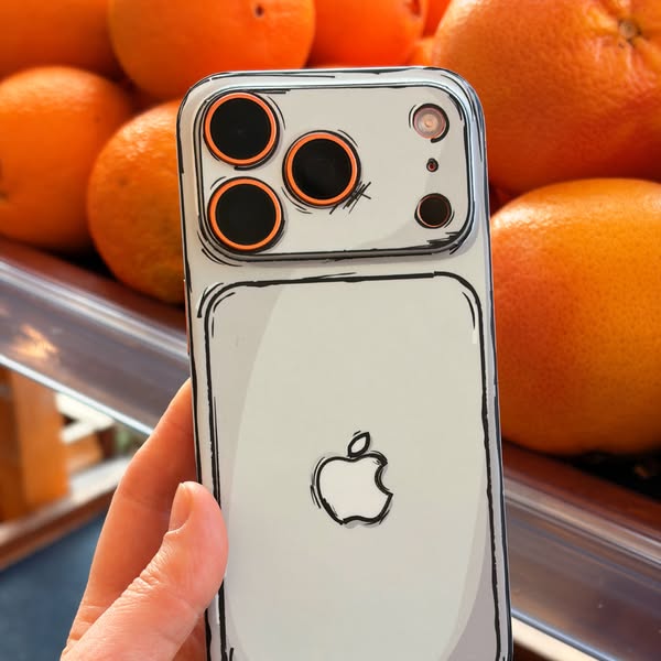
# Ad summary
This ad features a phone case with a cartoon-like design. The phone case is being held in front of a background of oranges.
# Brand positioning
The brand is not explicitly mentioned in the ad. However, the presence of the Apple logo on the phone case implies that the brand is associated with Apple products. The cartoon-like design of the phone case suggests a playful and creative brand identity. The brand seems to be targeting consumers who want to personalize their devices with unique and eye-catching accessories.
# Product
The product is a phone case designed for an iPhone. The case is clear with a white backing and has a black cartoon-like outline around the edges and camera lenses. The case features a cartoon-style Apple logo on the back. The design gives the phone a hand-drawn, animated appearance. The case is shown on a phone being held in someone's hand, suggesting it is easy to install and use. The product aims to offer a unique and personalized look for the iPhone, differentiating it from standard phone cases.
# Visual style
The ad has a bright and clean visual style. The cartoon-like design of the phone case stands out against the blurred background of oranges. The lighting is soft and natural, highlighting the details of the phone case and the surrounding elements.
# Hooks
Headline: None used
# Funnel stage
Top of funnel (Awareness)
# Pain points
None used.
# Value propositions
- The cartoon-like design offers a unique and playful way to personalize your iPhone.
# Benefits
- Unique and personalized look for iPhone
- Eye-catching design
- Protection for the phone
# Features
- Cartoon-like design
- Clear phone case
- White backing
- Black outline
- Cartoon-style Apple logo
# Call to action
None used.
# Social proof
- None used.
# Point of view
- Customer: The image shows a hand holding the phone case, giving the perspective of someone interacting with the product.
# Storyline
- The ad showcases a phone case with a cartoon-like design, held by a person. The intention is to highlight the unique and playful aesthetic of the phone case. The audience experiences this from the perspective of a potential customer being shown the product's design.
# Ad summary
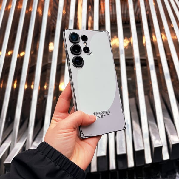
This ad features a hand holding a Samsung phone with a clear case on it. The case has a black line drawing of the Samsung logo on the back. The background is a blurred image of a metal structure.
# Brand positioning
Samsung is presented as a brand that embraces both innovation and personalization. The ad showcases a clear phone case with a hand-drawn style Samsung logo, suggesting a blend of high-tech functionality with a personal, artistic touch. This positions Samsung as a brand that not only provides cutting-edge technology but also encourages self-expression and customization, appealing to consumers who value individuality and creativity in their tech accessories.
# Product
The featured product is a clear phone case designed for a Samsung smartphone. The case is transparent, allowing the phone's original design to be visible while providing protection. It features a black line drawing of the Samsung logo on the back, giving it a unique, hand-drawn aesthetic. The case is shown on a Samsung phone with a multi-lens camera system, indicating compatibility with a specific model. The clear design addresses the purchase barrier of hiding the phone's original design, while the custom logo adds a personalized touch.
# Visual style
The ad has a clean and modern visual style. The focus is on the product, with a blurred background to draw attention to the phone and case. The lighting is bright and even, highlighting the details of the product. The overall aesthetic is simple and minimalist, with a focus on functionality and design.
# Hooks
Headline: None used
# Funnel stage
Middle of funnel (Consideration)
# Pain points
The ad addresses the pain point of wanting to protect your phone without hiding its original design.
# Value propositions
- Clear case allows the phone's original design to be visible while providing protection.
- Custom Samsung logo adds a personalized touch.
# Benefits
- Protection for the phone
- Personalized design
# Features
- Clear phone case
- Custom Samsung logo design
# Call to action
None used.
# Social proof
- None used.
# Point of view
- Brand: The entire image focuses on showcasing the Samsung phone case, emphasizing its design and compatibility with the phone.
# Storyline
- The ad begins with a close-up shot of a hand holding a Samsung phone with a clear case. This is intended to showcase the product in a real-world setting, allowing the audience to see how it looks and feels. The perspective is from the brand, highlighting the product's design and features.
How Other Technology Brands Advertise on Meta
Peer brands in Motion's library — click any brand to see their creative strategy, live ads, and AI breakdowns.