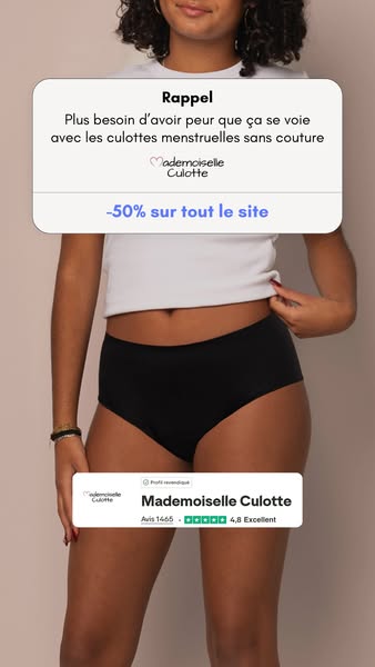

# Ad summary
This image ad for Mademoiselle Culotte promotes their menstrual underwear. It features a woman wearing the underwear and highlights the convenience of not needing to carry sanitary napkins. The ad also includes a discount offer and positive customer reviews.
# Brand positioning
Mademoiselle Culotte is presented as a modern and practical brand offering a solution to traditional period products. The brand positions itself as a provider of comfortable and reliable menstrual underwear, emphasizing convenience and freedom from carrying extra sanitary products. The brand aims to occupy a space in the consumer's mind as a go-to for sustainable and hassle-free period management, aligning with values of comfort, practicality, and discreetness. The brand pushes against the norms of traditional period products by offering a reusable and convenient alternative.
# Product
The featured product is menstrual underwear designed to replace traditional sanitary products like pads or tampons. The underwear is shown in a classic brief cut and black color. The ad highlights the convenience of the product, stating that users no longer need to carry three sanitary napkins in their bag. The product aims to address the purchase barrier of inconvenience associated with traditional period products by offering a reusable and discreet alternative. The ad also mentions a site-wide discount of 50%, incentivizing potential customers to try the product.
# Visual style
The ad has a clean and simple visual style with a focus on the product and its benefits. The production quality appears to be high, with good lighting and clear imagery. The use of rounded rectangles and soft colors gives the ad a friendly and approachable feel. The ad mimics a platform-native style, resembling a post one might see in a social media feed.
# Hooks
Headline: Rappel
Plus besoin d'emmener 3 serviettes dans ton sac avec les culottes menstruelles
# Funnel stage
Middle of funnel (Consideration)
# Pain points
The ad addresses the inconvenience of needing to carry multiple sanitary napkins while menstruating. The text states, "Plus besoin d'emmener 3 serviettes dans ton sac avec les culottes menstruelles," highlighting the frustration of having to carry bulky period products.
# Value propositions
- Convenience: Eliminates the need to carry sanitary napkins.
- Discount: 50% off on the entire site.
# Benefits
- No need to carry 3 sanitary napkins in your bag
# Features
- Menstrual underwear
# Call to action
None used.
# Social proof
- Avis 1465
4,8 Excellent
# Point of view
- Brand: The brand's POV is present in the top caption, which highlights the product's benefits and offers a solution to a common problem.
- Brand: The brand's POV is present in the bottom product block, which displays the brand's logo, customer reviews, and ratings.
- Customer: The customer's POV is represented through the customer review and rating in the bottom product block, providing social proof and building trust.
# Storyline
- The ad begins by reminding the viewer of a common inconvenience: needing to carry multiple sanitary napkins. This is told from the brand's perspective, setting up the problem that their product solves.
- Next, the ad introduces Mademoiselle Culotte's menstrual underwear as the solution, eliminating the need to carry extra sanitary products. This is told from the brand's perspective, showcasing the product's primary benefit.
- Finally, the ad includes a customer review and a discount offer to build trust and encourage purchase. This is told from the brand's perspective, providing social proof and an incentive to try the product.