
# Ad summary
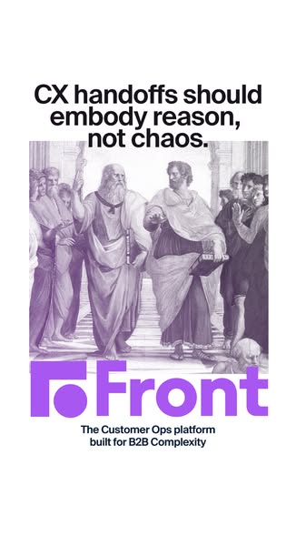
This image ad for Front uses a classical art style to convey the message that their Customer Ops platform brings reason, not chaos, to B2B complexity.
# Brand positioning
Front is presented as a solution to complex Customer Operations in the B2B world. The brand positions itself as a source of order and reason. By contrasting the chaos of typical B2B environments with the classical allusion of philosophical debate, Front suggests a calm and structured approach. This juxtaposition implies that the brand values clarity and efficiency, aiming to occupy a space in the consumer's mind as a provider of sophisticated and streamlined solutions for B2B customer operations, prioritizing functional benefits.
# Product
The advertised product is Front, a Customer Ops platform designed for B2B complexity. It is not a physical product but rather a software solution that aims to bring order and reason to what is described as the chaotic nature of business-to-business customer operations. The ad is targeted toward businesses that face challenges in managing customer interactions and data. The unique selling proposition (USP) is its ability to streamline complex customer operations, implying features such as efficient handoffs and a centralized platform. The ad addresses the barrier of chaotic and unorganized systems, positioning Front as a tool that resolves this issue.
# Visual style
The ad features a blend of classical art and modern branding elements. The production quality leans towards a polished design with a strategic use of color and typography. The visual motifs include the juxtaposition of historical artwork with contemporary brand presentation, suggesting both tradition and innovation. The image treatment involves a monochromatic purple tint and background removal, adding a modern twist to the classical artwork. The typography integration is clean and legible, reinforcing the theme of clarity and simplicity. The style contrasts with typical in-feed content by using high-design elements, potentially increasing stop power and scannability.
# Hooks
Headline: CX handoffs should embody reason, not chaos.
# Funnel stage
Top of funnel
# Pain points
The ad identifies the pain point as the chaos often associated with customer experience (CX) handoffs in B2B environments. This is explicitly stated through the phrase, "CX handoffs should embody reason, not chaos."
# Value propositions
- The Customer Ops platform built for B2B Complexity
- CX handoffs should embody reason, not chaos
# Benefits
- Embodies reason, not chaos
# Features
- Customer Ops platform
- Built for B2B Complexity
# Call to action
None used.
# Social proof
- None used.
# Point of view
- Brand, top caption, to convey the value that their product can provide.
- Brand, center image, to convey that they are aligned with bringing order.
- Brand, bottom block, to convey that they are a Customer Ops platform.
# Storyline
- The ad starts by highlighting the issue of chaotic CX handoffs, emphasizing the need for reason instead. This sets the stage by pinpointing a common frustration in customer experience, as told from the brand's point of view.
- Next, the ad visually reinforces the idea of bringing order to chaos using a classical painting that depicts philosophical discussions. This element aims to juxtapose the current operational disarray with a vision of structured thinking, providing a brand perspective.
- Finally, the ad introduces Front as the solution, stating that it's a platform built for B2B complexity. This completes the narrative by presenting Front as the tool to achieve the earlier mentioned reason and order, again from the brand’s perspective.